
QA Scorecard
QA Rubric
Site First Impression
Site First Impression - 4 points
(2 points)
Were you able to conclude who the company is and what they do within 5 seconds?
Even the most user-friendly and attractive websites are not successful when they are not achieving the needs of the company. Ask yourself: Do I as a first time visitor of this site get a clear sense of what they offer and who they are upon arrival at the website? Does the design point the visitors in the direction that they want them to go? Is there a clear strategy that is informing your design? If the answer to any of these questions are no, then the design is not at its full potential.
Open the website for the first time. Look over the hero section, count to five then turn off the screen. Now ask yourself “what do I recall?” If the category or type of business is obvious, the purpose is clear, and I have a clear understanding of what action the design is encouraging me to do, you will get points here.
It’s also important that the goal of the website is clearly indicated in the upper fold. Meaning, the info most important to the customer that they want visitors to know is clearly visible and there is a call to action that directs them towards the proper conversion.
CRITICAL ERROR
Open the website for the first time. Count to five then turn off the screen. Now ask yourself “what do I recall?” If you don’t know what they do, their headline is too vague. You just failed the Five Second Test.
(1 points)
Does the site resemble any wanted reference sites?
(1 point)
Did the site score of 75 on Google Lighthouse
The Google Lighthouse score is over 75%
The Google Lighthouse score is below 75%, and notations were left regarding the reason for this, and it’s evident that the low score was due to factors not in control of the builders.
The Google Lighthouse test was not run and there are no notes indicating that it was not completed.
Business Details
Business Details - 8 points
This is where we check the basic business information to ensure the pertinent details and motives for the website have been established and adhered to, as well as the way the logo was utilized in the header area of the website.
(2 points)
Business Contact Info
The phone number, email, physical address, and social media all appear correctly throughout the entire site.
CRITICAL ERROR
The phone number, email, physical address, and social media all appear correctly throughout the entire site.
Does not match in header
This is where either the phone number, email, physical address, and/or social media appear in the header, and contradict what is written in the intake form.
(i.e. - phone number is missing a number, email is misspelled, address is not formatted correctly).
Does not match in footer
This is where either the phone number, email, physical address, and/or social media appear in the footer, and contradict what is written in the intake form.
(i.e. - phone number is missing a number, email is misspelled, address is not formatted correctly).
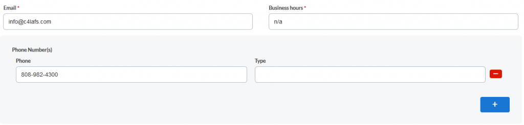

Does not match on Contact page
This is where either the phone number, email, physical address, and/or social media appear on the Contact page, and contradict what is written in the intake form.
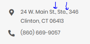
(i.e. - phone number is missing a number, email is misspelled, address is not formatted correctly).
Does not match elsewhere
This is where either the phone number, email, physical address, and/or social media appear somewhere other than the header, footer, and contact page, and contradict what is written in the intake form.
(i.e. - phone number is missing a number, email is misspelled, address is not formatted correctly).
This is referring to when contact info is placed within the content area of a page. The contact info needs to be in the proper format for the region.
It’s also necessary that the info is in a consistent format from page to page, row to row, section to section.
Contact pages should be straight to the point & easy to navigate. The basic contact info should be displayed along with a standard contact form as well. There is no need to overuse images or have a long scroll on this page as it is just a means for customers to get a hold of the business owner. Below are some good examples of contact pages laid out in a nice manner:
EX 1:
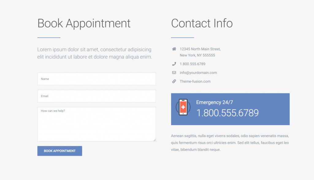
EX 2:
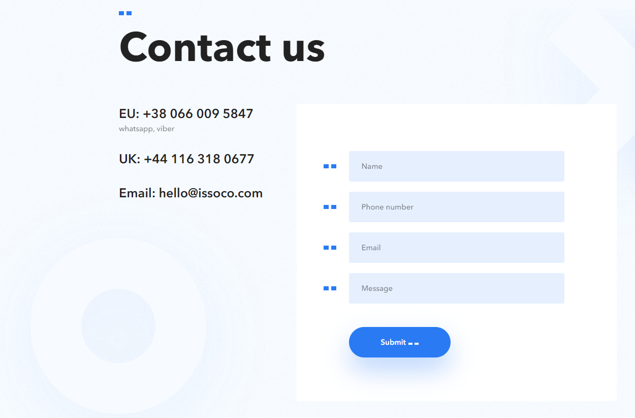
(2 points)
Logo - Graphic
Your logo fits perfectly and it doesn’t take up much space. It looks in proportion with the other elements on the page and it resizes without losing clarity.
The Logo may not have a graphic, and just be text.
If the logo was deemed by the designer or WS as not appropriate for the header, or the customer didn’t supply a logo, text can be used in its place. In this case, it will be marked as acceptable and the Builder will be awarded points despite no graphic being present.

This would be where the background color of the header is set to one color, and the logo image itself contains a background with a different color.

Logo contains illegible text that could have been cropped out
This is where a logo is used that has completely illegible text. If a logo has text that is too small to appear in a header, it must be cropped out and typed in the hero section, or omitted altogether.

The logo appears pixelated in one or more of the following browsers: Chrome, Firefox, Edge

Your logo is easy to see, but it’s too big. You take up more space than you need and this means other information get’s moved further down the page. If the logo alone causes the header to go beyond 200px in height, you will lose points.
EX 1:

EX 2:

EX 3:

Your logo is easy to see, but it’s too big. You take up more space than you need and this means other information get’s moved further down the page. If the logo alone causes the header to go beyond 200px in height, you will lose points.
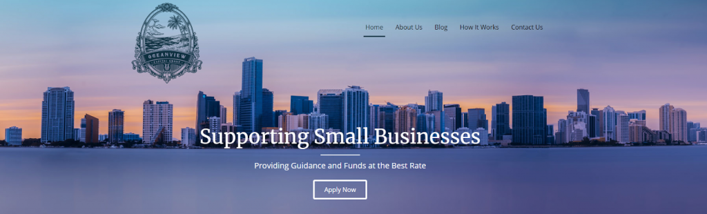
Sometimes a logo CAN be used in the header, but you might have to be creative with how to use it. Depending on the logo's shape, size, and detail, it might need to be placed in a specific way.
- It might need to overlap into the hero section
- It may need to go in the middle of the nav
(2 points)
Logo - Text
The logo text has a good contrast, the font used is appropriate, and the size fits well in the header.
This is where the company name or any text that is aligned next to or below the logo graphic are not horizontally or vertically aligned.
If the Designer crops out any text around a logo, or adds their own text next to a logo, it needs to match the personality and theme of the logo and industry. In addition, the text must be a legible font family, and have the appropriate size, color, decoration, and weight.
Points will be deducted when text is placed below the logo causing the header to have an inappropriate increase in height, when it could have been placed next to the logo graphic or in the hero.
EX 1:

EX 2:
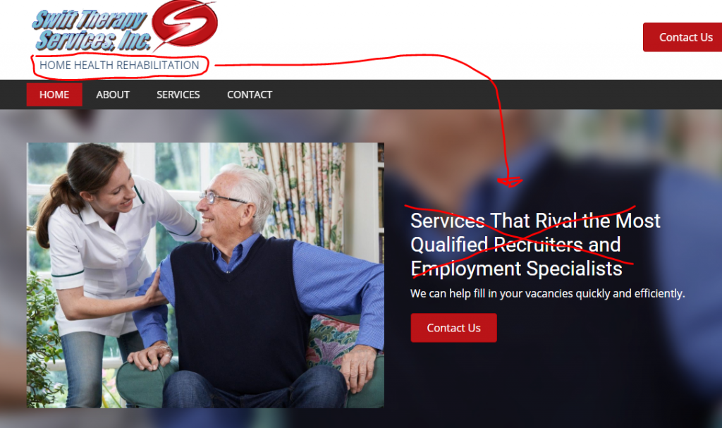
This would be a condition where the logo clearly contains the name of the business, and is legible, and in spite of this we also added the name of the company in plain text. Thus, the logo and logo text are duplicates of the same content.
If the logo is just a symbol, or the text designed within the logo is not legible, you need to write out the company name next to the logo graphic.

If the logo is just a symbol, or the text designed within the logo is not legible, you need to write out the company name next to the logo graphic.
(2 points)
Logo - General
The logo text has a good contrast, the font used is appropriate, and the size fits well in the header.
CRITICAL ERROR
Logos can be modified in terms of cropping and rearranging elements of the logo to better fit the header area. In addition, logos can also have the background removed, or made all monochromatic.
In the case of a vertical logo graphic stacked upon text, it might make sense to cut the graphic from the text and place these images inline.
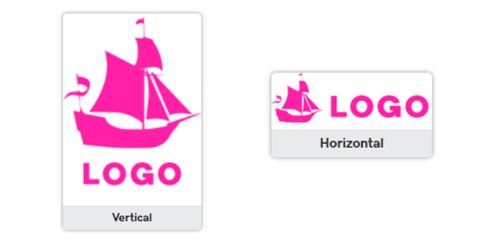
If the text around, below, or next a logo is illegible, it’s appropriate to crop out the graphic from
Logo and type out the next to it instead.
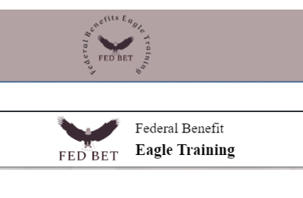
If the logo has a white background but is a high quality image, it may be easy to remove the background, if that's the case, do it. If the logo has a white background but is a low quality image, pixelated or if after removing the background you're left with ragged edges, don't use a transparent header - use a header with a white or a heavily opaque background that hides the uneven edges on the image.
Other than this, do not modify the logo itself. Do not modify the text, color, or design built into the graphic.
Logo graphic and/or text need to link to the home page. It is also important that the link is not an absolute URL, but instead uses a relative URL.
This is where the customer supplied an acceptable logo, it was labeled correctly by the WS as the logo to be used, but it was not used. Could also be that the customer supplied a logo, and it was used, but not placed in the proper place.
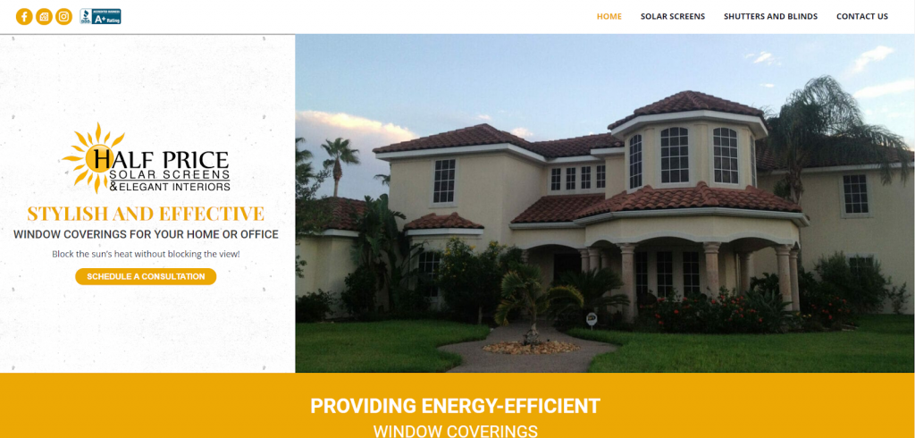
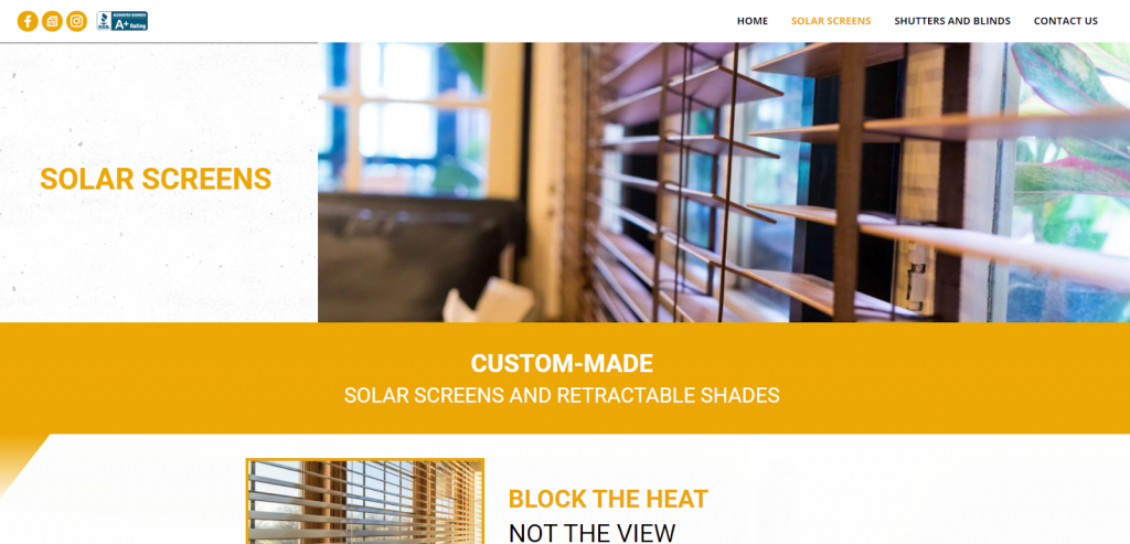
In the below example, the right thing was done, which was not using the detailed logo illustration in the header. However, no icon, text, or anything was placed in the header. Even if you use the logo in the hero instead of the header, you need to put the company name or a simplified version of the logo in the header.
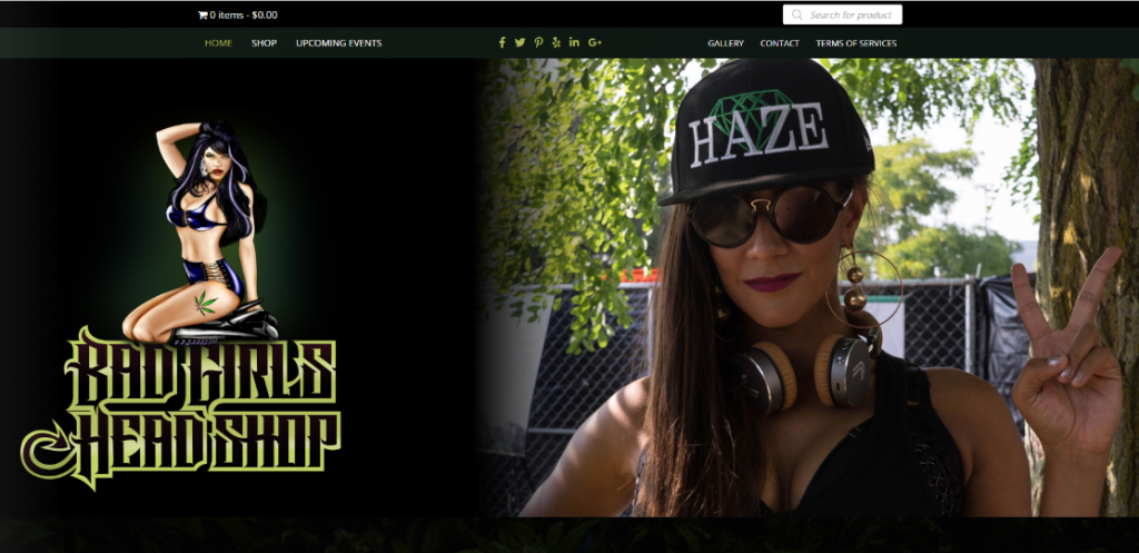
CRITICAL ERROR
This is where there are specific instructions from the Website Specialist on which logo is to go in the header, but instead a different logo is used.
This is where the logo or text next to the logo has less than a 4.5:1 contrast against the background.

Header/Footer
Header/Footer - 13 points
This grades the overall style and layout of the header, navigation, and footer.
(3 points)
Header - Layout
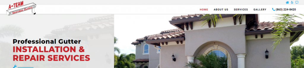
An acceptable header will consist of a logo and navigation menu. It will have the logo left aligned , and the navigation aligned to the right. It can vary in width, but the height needs to be as thin as possible. The vast majority of sites should have either a white background, or a 100% transparent background.
This is where the hero content goes full width, but the header content is fixed width. The header generally sets the precedent for the whole website, so you need to make sure the header is full width when needed.
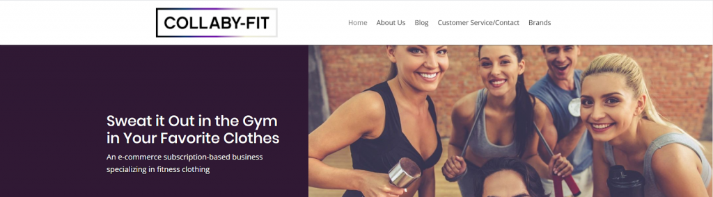
This is where the header is too tall due to excessive padding/margin or too many elements or rows stacked one upon the other. If the header is too tall due to the logo, do not deduct points here, as that was already accounted for. This is reserved for a header that is too tall despite the logo being an appropriate site.
EX 1:

EX 2:

We need to keep header elements to a minimum. If they want a phone number, it should be aligned with the navigation on the right, appear only in mobile view, or placed in a slim top bar if header 1 is selected. If they want an email address, we should just use an envelope icon. If they ask for a tagline, it should be used in the hero. If they want a CTA, it should be in the right corner, flush with the navigation, or just reserved for the hero section.

If the header and hero are both set to fixed width, and the hero text is left aligned, then the left side of the logo and the left side of the hero text should be flush. If they are not aligned, it looks off.
EX 1:

EX 2:

The elements in the header need to be laid out in a clean, organized way. If a phone number is added, it should not be placed awkwardly above the navigation, like the example below. Icons, phone number, etc. should be flush with the navigation. If doing so causes the header to be too cluttered, then make the header full width. Other alternatives are to use a hamburger icon or an off colored row above the navigation.
So don’t do this:

Instead, do this:
The goal is always to make the header as slim as possible. Avoid making an extra row for a single element, like one icon, or one phone number. Instead, add those elements flush with the navigation.
EX 1:

EX 2:

The goal is always to make the header as slim as possible. Avoid making an extra row for a single element, like one icon, or one phone number. Instead, add those elements flush with the navigation.
The range of acceptable padding between elements is 7-10% of its container. For example, if you have a container that is 500px wide, then you need to have 35px - 50px of space between elements.
The header and all elements within the hero need to look identical between all browsers. If anything is missing, aligned differently, or conflict in any way points may be deducted
CRITICAL ERROR
(3 points)
Header - Style
No issues with the way the header is styled.
Header background colors should be white or 100% transparent. In some rare cases if the entire site is dark, it can be dark gray or black. Never use colors from the color pallet that was requested as the header background.
EX 1:

EX 2:

The below header, while its an older layout, consists of peach, blue, black, and white. Generally you want to pick a base of white background (unless its transparent) and pick one, possibly two accent colors. Black would be considered one accent color. The goal is to be monochromatic overall, and utilize at least one accent color. If you start using 3,4 or more colors in a header, points will be deducted.

Only use sticky nav with slim, solid color headers
If you choose a transparent header, but the image that the logo and text is laid over makes it so you can not read the text, you used transparency in appropriately. The header should also be 100% solid white or fully transparent unless specifically called for by the customer.
(2 points)
Navigation - Function
The navigation links all link properly with no issues.
This is where a hamburger icon was used where there were 4 or less navigation links, with no single link being above 20 characters. The exception will be if the hamburger icon was specifically requested by the WS, if that is the case, you can use it. The other exception is if the header already contains 2 or more additional elements (aside from the logo) aligned with the navigation and logo in which a navigation menu would have caused text wrapping or an otherwise cluttered look.

This is where an anchor link does not link appropriately in any way, whether it’s the wrong section, the wrong part of the correct section, or the wrong page entirely. Also if there is a broken link that was intended to be an anchor link, but was not set up. In order for this to be the case, the section not linked to must be present on the site.
This is where the navigation links go to the wrong page or external url than what was communicated in the send up.
All navigation menu links that link to an external URL must open in a new tab.
If the intake form calls for certain navigation links to be present, or a clear order of navigation links has been established, it needs to be followed. If it's found that any tabs, whether in the main nav or sub nav are supposed to be there and are missing, or they are in the wrong order, points will be deducted.
(2 points)
Navigation - Style
The logo is the correct size, is simple, has proper contrast, and works perfectly as a logo in the header. If it is a Simple site that has no navigation menu, then this will be marked as acceptable.
This would be an instance where the navigation is not visible against the background. The background of the header and the navigation color have a contrast of less than 4.5:1.

This is where the active/hover style has contrast below 4.5:1, or the color does not match the rest of the site. A different background color for a navigation menu that fits within a narrow header will also violate this rule. 100% transparent headers may use a background color for active/hover, but it should have rounded colors to look like a button.
EX 1:

EX 2:

Points will be deducted when text is placed below the logo causing the header to have an inappropriate increase in height, when it could have been placed next to the logo graphic or in the hero.
EX 1:
EX 2:
This is where the font style or decoration is not appropriate. This can be used for italic, bold, or other unnecessary styling of the font, but mainly if the font family is not appropriate. The navigation font should be very easy to read.
EX 1:
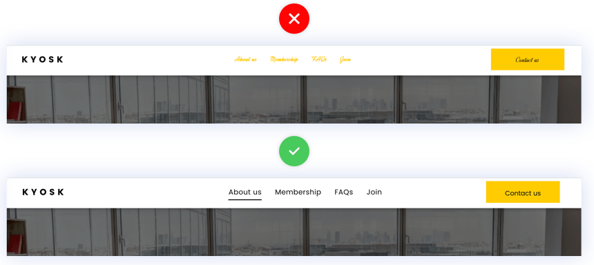
EX 2:

Navigation text needs to match the general text size and style of the rest of the site. If the font size is too small, below 13px, or too tall, which is over 21px, and there is no justification for this kind of sizing based on the design, points will be deducted.
Navigation text should be legible, and not overpowering. You should not use ultra bold font style, nor should you use ultra thin. Also things like underline (non active links) or italic should be avoided unless specifically called for.
Too bold

Underline should not be used like this

Acceptable text styling

In the case where many drop down navigation menu items are requested to the point that it causes the menu to beyond the height of the screen on any laptop or desktop, points will be deducted. If this is requested, it is required of the Builder to call this out, and suggest an alternative to an overly long navigation menu.
This could be where the drop down navigation menu has an active/hover text or background color that is not used anywhere else on the site, or the colors have poor contrast. It could be where the drop down menu alignment is off, has too much or too little padding, or has any other issue that clearly violates principles of good web design.
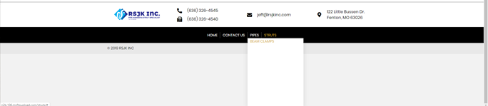
This would be an instance where there is too much space, too little space, or inconsistent spacing between navigation buttons. This would also be if the navigation is not properly vertically aligned within the container.
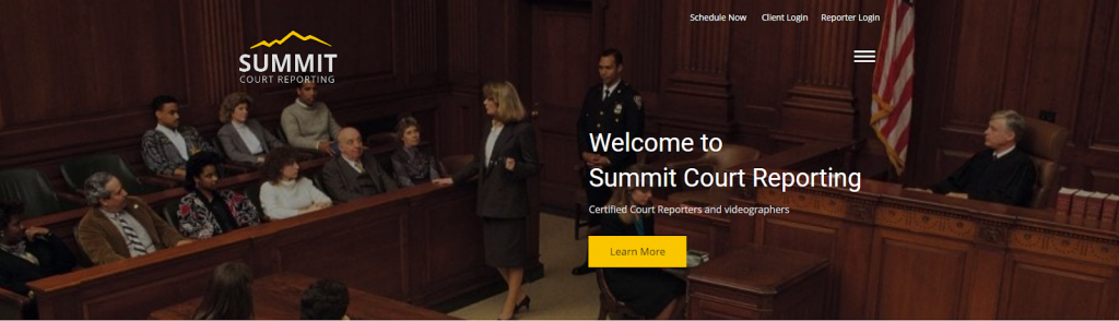
If a WS gives a navigation link that is more than 26 characters long, it needs to be shortened. The Builder has the discretion to shorten overly long navigation buttons. If the customer insists on the name, it can be corrected during revisions.
CRITICAL ERROR
If the customer provides a specific format or style for the navigation menu that is in scope, and is not detrimental to the overall design, it must be implemented. If you cannot accomplish what they are asking, it needs to be mentioned in the delivery notes.
(3 points)
Footer Design and Content
A footer needs to be simple, consistent, clean, and contain the proper elements called for by the customer.
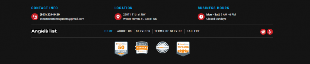
Points will be deducted if there are any social, email, anchor or site links that are broken or link to the incorrect destination.
If you choose a fixed width, but pack too much content into too many rows, causing the rows to look squished and unprofessional, points will be deducted. Conversely, if you have selected a full width content layout, but have minimal content to where everything is spaced way too far apart, you will also lose points.
The range of acceptable margin or padding between elements is 7-10% of its container. For example, if you have a container that is 500px wide, then you need to have 35px - 50px of space between elements.
Sometimes the layout of the footer has to be dictated by the content. If you design layout first, without any regard for the content, you risk leaving the site looking like the less ideal examples below.
EX 1:
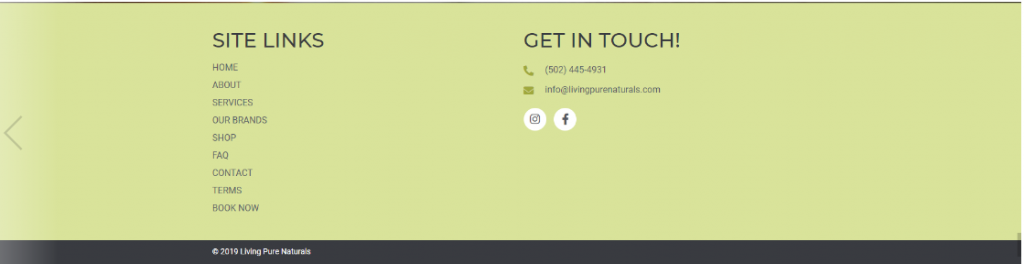
EX 2:

EX 3:

EX 4:
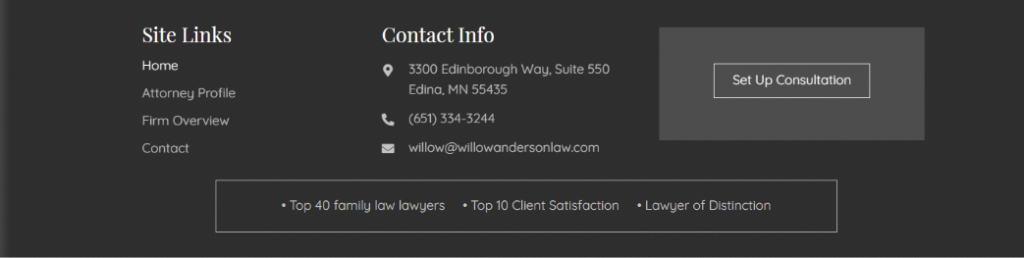
There are seven different colors used in the footer. light gray, dark gray, white, black, green, purple, and orange. Need to give the footer a simple and professional color scheme, limit the footer to 3-4 colors.

The intake form has the different elements a customer is asking for in the footer. Make sure all the elements from the intake form are displayed in the footer.
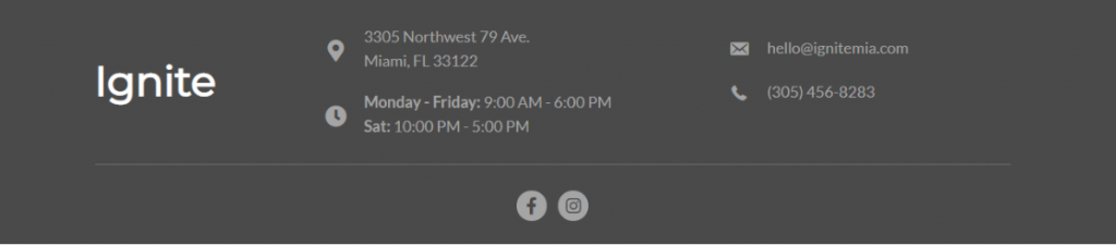
This is an example of a difficult to read hours of operation format. Each day should be on its own line.
EX 1:
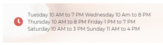
EX 2:
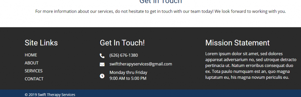
If the entire site makes use of lorem ipsum text, it's acceptable to keep the footer mission statement or call to action as lorem ipsum text. However, if copy writing was completed for the site, then either 1. Text must be written to replace lorem ipsum text in the footer, or 2. You must remove the section and distribute content from the other columns to fill the gap. We want to avoid the footer being the only place on the site with lorem ipsum text.
This can include anything from the footer not including the right links, having a drop down menu, links being in the wrong order, or the navigation wrapping into another line when it could be avoided.
Footers are a popular place to put things like embed codes, certifications, widgets, or other badges. Sometimes if we paste in the code and miss a closing tag for example, the actual html may display on the site. If any back end code shows up on the front end, it would be marked as an error. This call out is specifically for the footer.
CRITICAL ERROR
If the Website Specialist notated specific requests for the footer that are in scope they need to be followed.
Hero Sections
Hero Sections - 17 points
By best practices a good hero typically has a header, some supporting text, and a call-to-action button (or some kind of next steps). These can be accompanied by an image, video, or illustration that support the mission of the page.
(2 points)
Home Hero - Elements
An acceptable hero section should contain a CTA and a heading. There may be some circumstances in which you don’t have them, but it should be limited to where we are copying old sites, or the customer specifically asked not to include these elements.
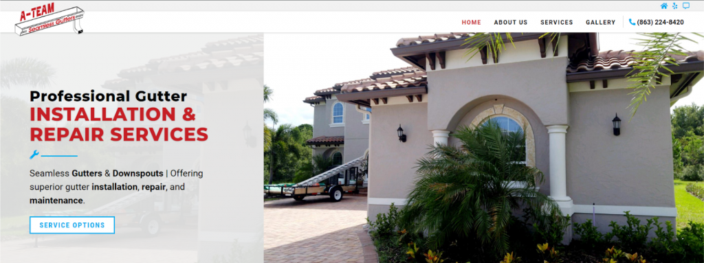
This would be where there is a hero image on a home page and no heading or any text above the fold that would indicate what kind of site it is.
This is where no Call to Action button, Form, or anything that allows the user to take the proper action once they land on the site.
In this case the CTA and hero heading are both missing
(3 points)
Home Hero - Layout
An acceptable hero can be seen below. It contains all the proper elements, good white space, color contrast, layout, and fonts
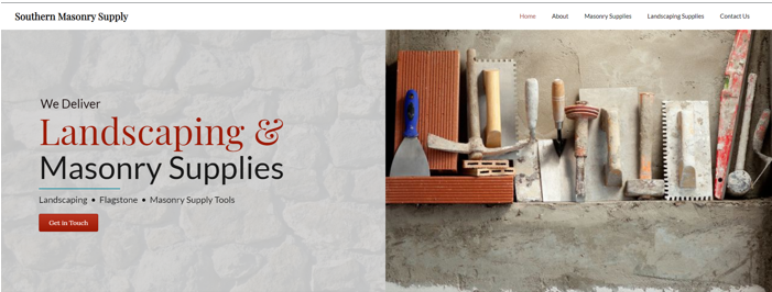
You want to keep the hero section as straight and to the point as possible. If the hero section has too many rows of text, the text is hard to read, nothing stands out, or there are just too many elements, you may have points deducted for a cluttered header.
EX 1:
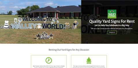
EX 2:
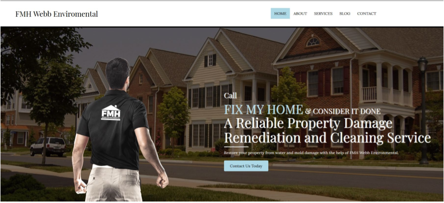
It is important for your CTA to stand out from the rest of the text so it’s clear to the user what you want them to click. If your CTA blends in too much to the hero section, uses text that is not legible or has poor contrast, or has a background or border color that clashes or does not match the rest of the site, you will lose points.
Let’s not forget our true objective, which is, get people to click on the CTA. Contrasting colors do a great job at making your CTA stand out.
For example, look at ReminderMedia’s hero image and the CTAs color contrast. “Get A Free Sample” and “Sign Up” stand out and capture attention.
EX 1:

EX 2:

The hero image you choose will determine what layout options you have.
- Rule of thirds1/3 or more of the image may include a gradient overlay to place behind the text if there is insufficient color contrast.

- Overlay
- Text laid out over the image.
- Usually centered text, sometimes left aligned.
- Sometimes requires transparent color overlay for proper contrast.

- The stripe
Content box does not “float”, it touches the top and bottom of the container.
- Split
In design, grids are paramount, and it looks like website design team Float knew just this when it came time to design their own site. Check out the way we split thr hero image up into two separate blocks – one photographic and one typographic.This super simple technique helps to break up the image and direct the eye around the page in a smooth, logical way – not to mention, the block of type is colored in a way that brings some vibrance to the design!
50/50 split
60/40 split
Solid color or transparency behind the text

- Floating box

For example, the below 2 images didn’t use the proper layout.
EX 1:

EX 2:

If you choose a “stripe” layout, you want to make sure the overlay stretches the full height of the hero section. We want to stay away from transparent floating boxes. Text needs to be placed directly over images in most cases. Stay away from confining text within a box.
EX 1:

EX 2:

This is an instance where you may have used the right layout, but the color choice doesn’t work with the site. If you have a “stripe” layout that has a transparent box, you want to make sure the box has colors that work well with the site or hero image.
If you are using the split layout, you want to make sure the background color is more neutral, or is using a slight gradient, texture, or background image. If the color background is too overpowering like the following examples, points will be deducted.
EX 1:
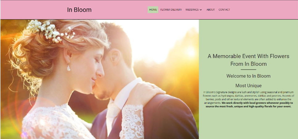
EX 2:

EX 3:

You want to use at least 7-10% padding within a container in the hero section. So you will need to adjust each time based on the width. So if the width is 800px, you would want at least 56-80px of padding.
EX 1:

EX 2:

If the hero text cannot be seen until you scroll down on either desktop or laptop view, you will lose points.
CRITICAL ERROR
It’s important that we try to always follow specific customer instructions. This may be in the form of a drawing, pdf or Word mock up, or a reference site. We do our best to set the expectations that we cannot duplicate other sites or specific instructions, but we will follow them as closely as possible. If the customer provided instructions or gave references that are in scope for us to emulate in the design, we need to do so. If this cannot be done for whatever reason, you need to notate a clear justification on why you didn’t follow the customer instructions.
(3 points)
Home Hero - Image
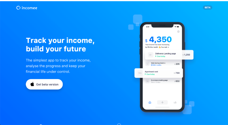
Since hero images dominate the above the fold area, it is critical that you pick something that not only looks good but also pushes your conversion goals. Hero images can simply display a product, or provide context to your service or product. It can be emotion focused, in which amplify the way the users feel to emphasize the importance of a product or service. Whatever it’s chosen, it sets the tone of the entire site. It needs to capture attention, and show off your product or service, or amplify whatever emotion you are trying to create.
CRITICAL ERROR
The image needs to reflect the product, service, or information of the customer.
If your company deals in sky diving equipment, would it make sense for you to put up a hero image of a person scuba diving?
As seen in the example below, we don’t want to show overgrown grass on a landscaping site.
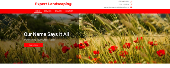
It only makes sense to relate your hero image to the rest of your website. The image must reflect your brand’s values and principles. If the image is deemed completely unrelated to the business or casts the business in a negative light points may be deducted.
This is an instance where the main focal point, like the face of a person, for example, is cropped out or covered by header or hero text of the hero image when it was clearly intended to be present on the site.
We should never use a hero image if the quality is not sufficient. If the image is the focal point, and is pixelated or blurry, it should not be used. If it was specifically asked for, just notate that it does not meet our standard for image quality, and we chose a different image. If the customer still wants it, it can be added during revisions.
If you choose a stripe or overlay layout for the hero, it’s important that you don’t use too much or too little transparency. If the site contains a brighter, lighter tone, you don’t want black or dark gray boxes over the hero, with minimal or no opacity.
Alternatively, you need to make sure the overlay is sufficient for the text to be seen. If the contrast is poor using the overlay or stripe, it can result in the hero headline not standing out.
Your brand is judged based on the colors you use. There may be instances where a hero image contains bright colors that don’t match the rest of the site. Another example could be there are bright colors used as accents throughout the site, but the hero image is black and white. If this is the case, points will be deducted if the hero image contains bold, bright colors that don’t match with anything anywhere else on the site.
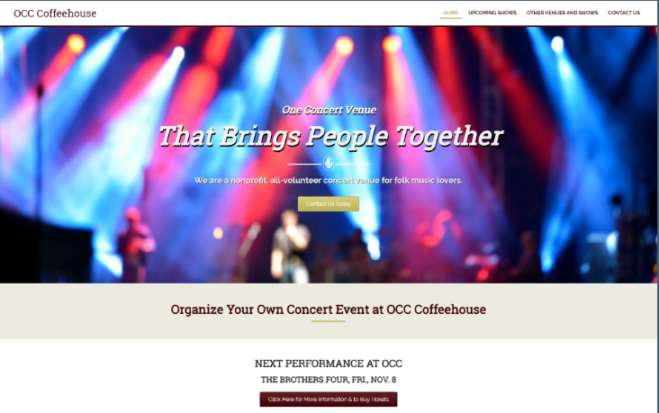
CRITICAL ERROR
There will be instances where the customer or Website Specialist asks to use a hero image that just cannot be used for the hero. Maybe it's too small, for example. If that is the case, you can notate the reason it could not be used, and that is acceptable.
However, if the customer provided an image that was specifically called for to be used in the hero section, and the image was of proper size, content, and quality, and it was not used for whatever reason, points will be deducted.
When you use the split layout, it's a good idea to use a background image behind the text. However, you need to avoid exactly mirroring the hero image.

This is distracting, and should be avoided. A better practice is to zoom in one part of the image, as seen below.

We do understand that occasionally slideshows must be used. If the proper layout is chosen, and the customer demands them, then it’s acceptable to use them.
However, there are still ways to use it that would not be up to our QA standards. If an inappropriate effect is used for the slideshow, or the slides are going too fast or too slow, or anything that would be considered an inappropriate use of a slider, points would be deducted.
Using video background above the fold works great at capturing attention, but there are three things you need to consider:
Do your users have fast enough connections to play the background video automatically?
Are your users older and hence, are liable to get confused by autoplaying background video?
Are your users accessing your site from devices or locations that can’t support background video?
There may be instances where the video is either too large, the wrong file format, or was not set up correctly within Beaver Builder. If the video is causing the browser to crash, or a prolonged load time, then it’s best to seek an alternative. If the Website Specialist is asking for a video to be added as a background, it must be tested before delivering to ensure appropriate load time. Points will be deducted if a site is delivered with a background video that is not working as it should.
(3 points)
Home Hero - Text Styling
When it comes to the hero image, It’s a good idea to pick an image that resonates with your copy (the hero headline). If you can make the image amplify the copy, all the better.
“The right typography makes reading a website’s content effortless, while poor typography sends readers away.”
Color plays a huge role in web typography best practice. Therefore, carefully contrasting the text and background colors can boost the legibility of texts.
If the text over the background fails the color contrast ratio test (see color contrast section), points will be deducted.
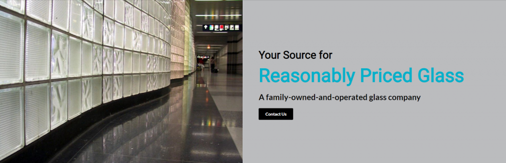
Avoid text colors that clash or are not appropriate against hero image colors
EX 1:

EX 2:
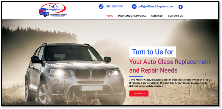
When it comes to alignment over hero text, you want to go with a formula you know works. If you left align text, it should be flush left with the content. If you center align text, it should be centered within its container. The following are examples where this was not followed and points were deducted.
EX 1:
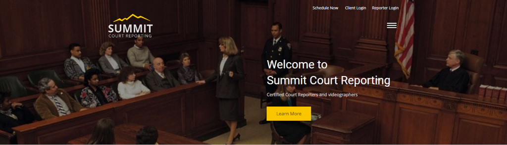
EX 2:

EX 3:

Be careful using text shadows with your hero headings. You can see in the example below, they are very distracting.
Hero text should be large enough and have good enough contrast where text shadows are not necessary. If you do need some text shadow, the spread should be at least 5px to avoid a hard line.
EX 1:

EX 2:
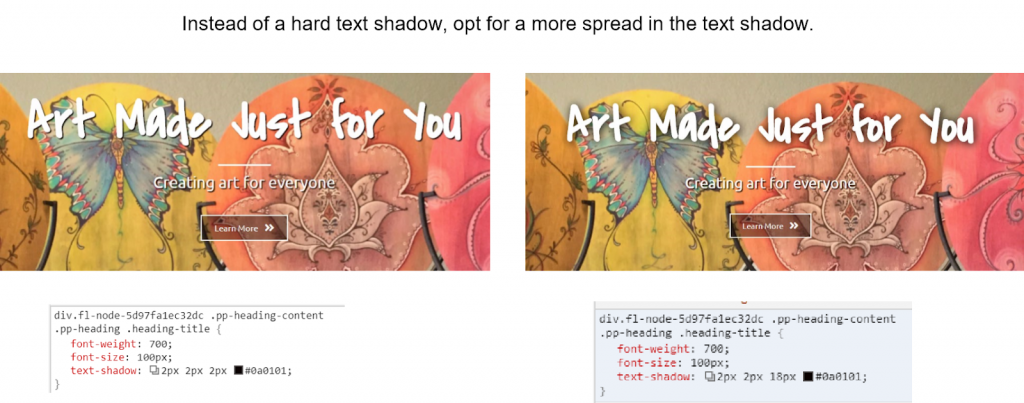
See https://styleguide.pwsgallery.com/page-layout-flow/ when trying to figure out what fonts to pair.
Good typography and using the best font combinations elevate a design from its competitors and creates a better user experience. Effective type combinations add visual interest to a design that can keep a visitor on the page longer.
Bad type, by contrast, can make content harder to read and less pleasurable for the person reading it.
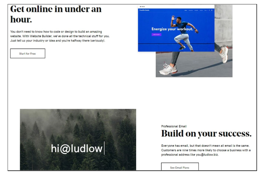
When pairing different fonts, ensure the font families complement each other based on their character width. Avoid pairing serif fonts with serif fonts.
EX 1:

EX 2:
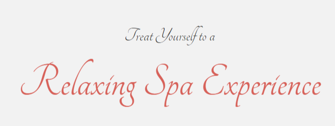
Finding typefaces that have noticeable but not extreme differences in weight is easiest. Designers can branch out from there into more prominent distinctions.
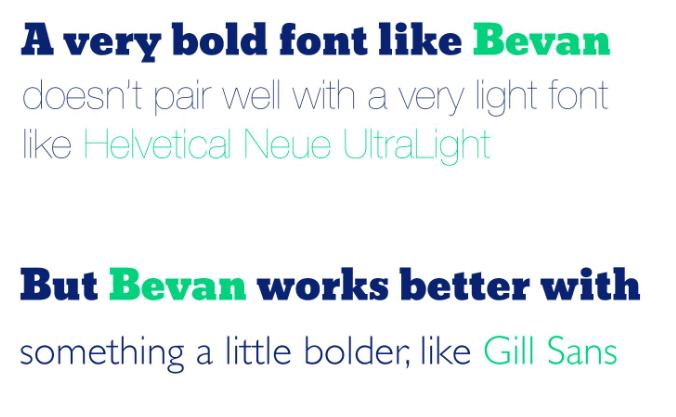
See:
https://www.toptal.com/designers/typography/font-combinations
and
When using fonts in a hero image or as the center of focus when arriving at a web page, pair the fonts to draw attention to the focus words representing the site or leading towards the defined call-to-action.
Focus can be drawn from large differences in size, color contrast or by using two different fonts in sequence.
There needs to be a message that can be instantly recognized and read. You need to have larger text somewhere with a simple, bold message to orient the user.
EX 1:
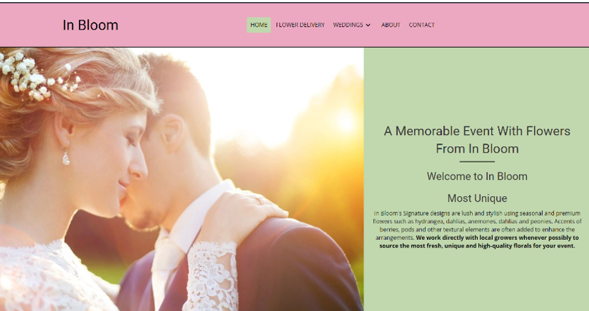
EX 2:
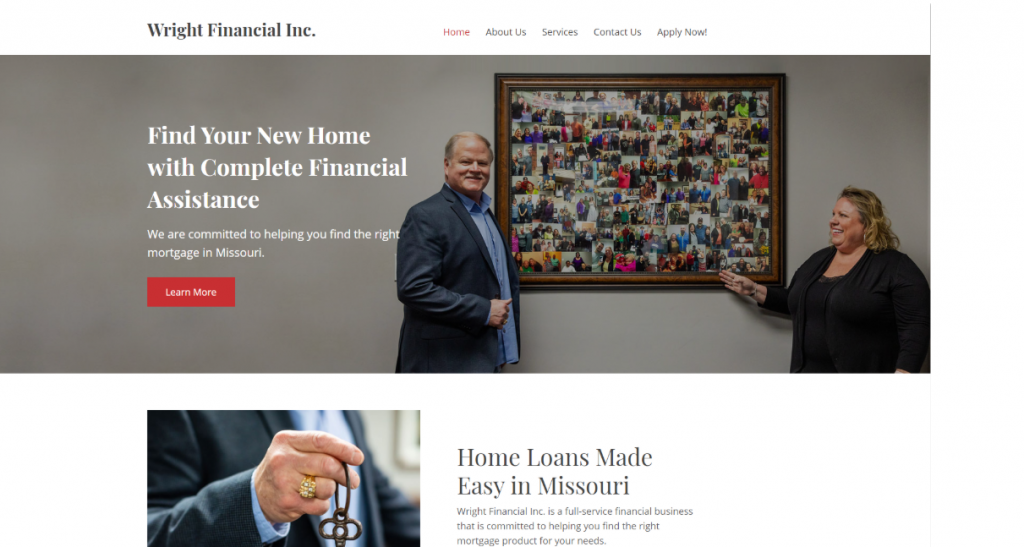
EX 3:
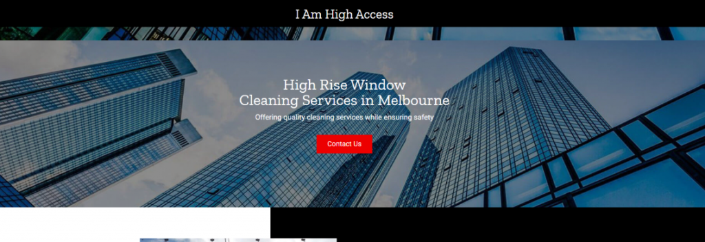
Capitalizing all characters on a text or message makes it appear like you are screaming and imposing on your readers.
It is unpleasant to the eyes and most of the readers won’t even get to the end of the message as it will likely put them off.

If you have a hero image that has text within the image, never overlay text on that image. Text over text is a bad look and it will lose you points.
EX 1:
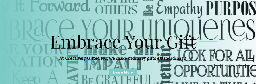
EX 2:
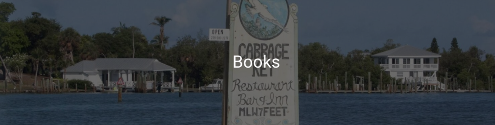
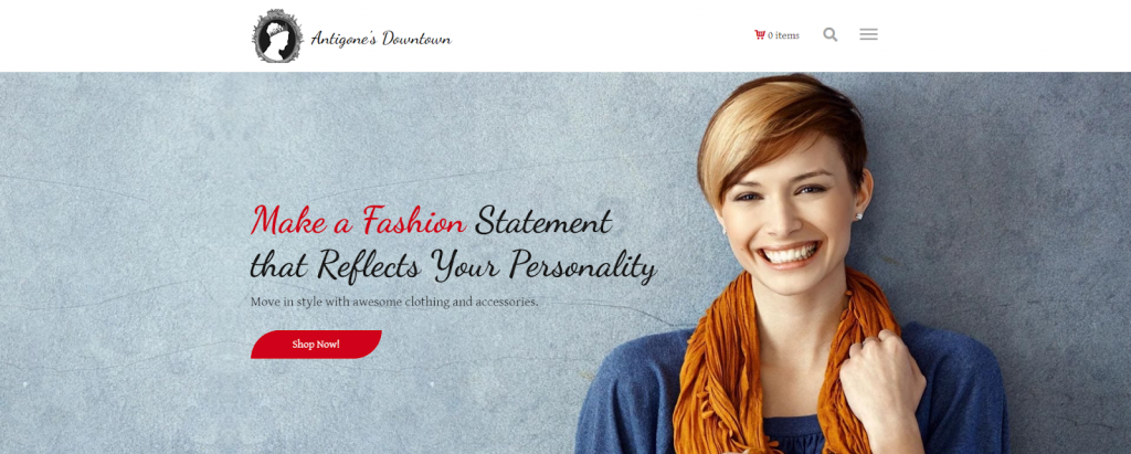
Its important that when we are creating hero headlines, the right text stands out. If you change font colors, style, family, or size in order to emphasize certain words, in imperative the words you emphasize are the most relevant to the user. For example “Make a Fashion” is emphasized, but those words on their own make no sense. The below examples would lose points.
EX 1:
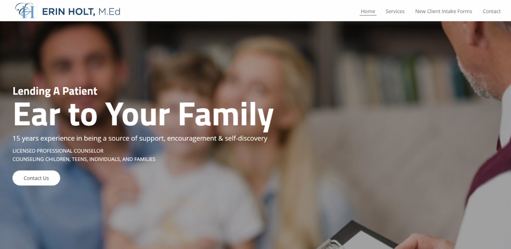
EX 2:
(3 points)
Home Hero - Wording
When done right, text can greatly amplify the brand message.
For example, on Airbnb’s homepage, you’ll see a video of people meeting others in a different city for the first time. The copy says, “Live There”. As the video shows, they don’t want you to just visit a city; they want you to live there and experience the local lifestyle.
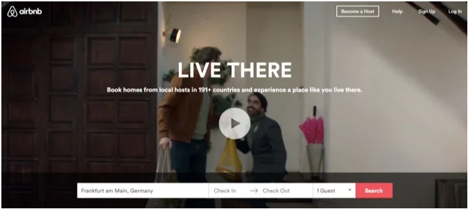
Keep in mind that captions over hero images are read, on average, 300% more than body copy. That’s insane! Ensuring that caption is accurate, targeted and matches the hero image is SO important!
CRITICAL ERROR
If the first thing a user reads on the website contains blatant spelling or grammatical errors, then immediately the credibility of your site goes down the tubes. This critical error must be avoided, and the hero message needs to be clear, free of errors, simple, relevant, and inviting.
EX 1:

EX 2:
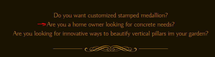
Sometimes descriptions below the hero headline are not necessary. Too much text clutters up the hero area, and makes it so nothing really stands out. If the description interferes with the aesthetics of the hero image, it should be omitted.
Hero descriptions should never exceed 3 lines, and should not exceed 50-60 characters (including spaces) per line.
Keep the text to a minimum! A picture is worth 1000 words, so make sure any additional words are straight to the point.
Hero banners are really popular—like the one below from the Dollar Shave Club. Its high-quality imagery paired with simple text and a call to action.
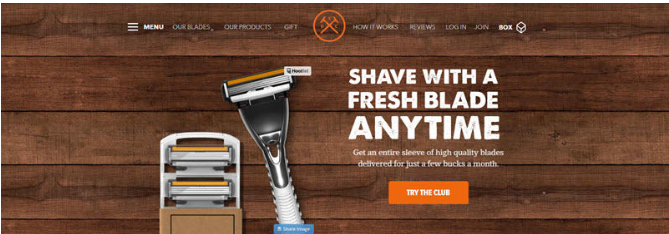
Once the hero heading goes beyond 8 words, it risks not standing out at all. Effective hero headings are generally 3-8 words long. Anything hero heading 12 or more words will be considered too long, usually. Break up text using a hero description instead of fitting it all in the heading.
EX 1:

EX 2:
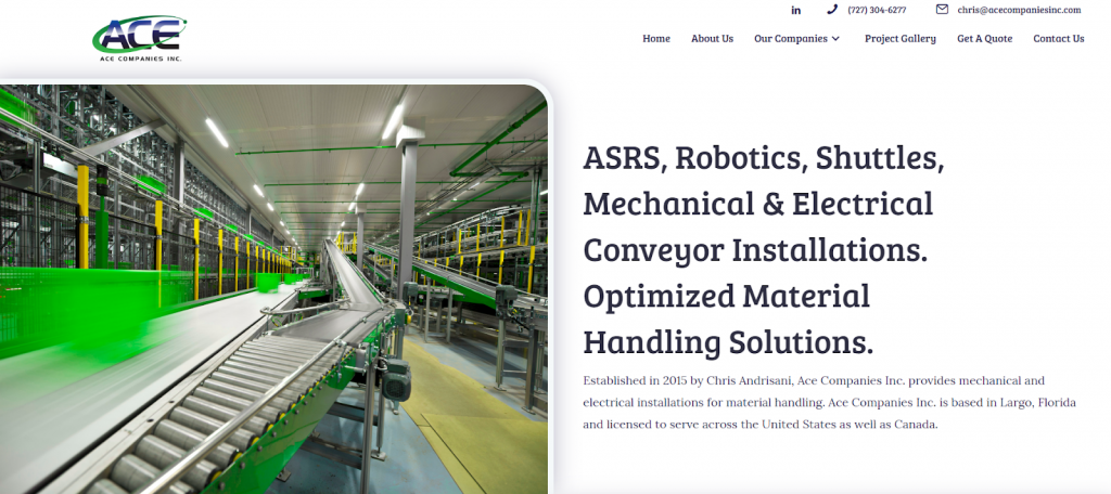
Avoid “Welcome to [name of company]” as the most prominent text in the upper fold. This tells us nothing about what they do, and is usually a repeat of text in the header. Come up with something that is descriptive and brief to place in the hero.

Homepage headlines often fail to say what the business does. Instead, they offer a general statement about quality or value.
The visitor’s first question is “am I in the right place?” The headline should answer this question by explicitly stating the main business category. Make the headline text descriptive, so every visitor can tell what you do, at a glance, within seconds.

The way to fix the above example is
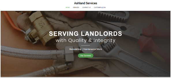
Taglines and slogans are generally best placed in the hero. There may be some exceptions to this where the tagline/slogan is best paired with the logo/company name in the header. If that is the case, you don’t want to duplicate the same text in both the header and hero. This also goes for the logo. If the logo is in the header, don’t place it in the hero.
EX 1:
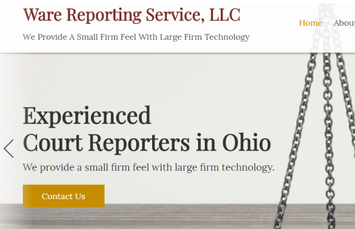
EX 2:

(3 points)
Interior Hero Section
Keep the hero height in the interior section in the range of 200-350 pixels tall if you use an overlay layout. Have text placed over the hero image, like the example below. Make sure there is proper contrast for the text, and that the text is not over any focal points, or text within an image.
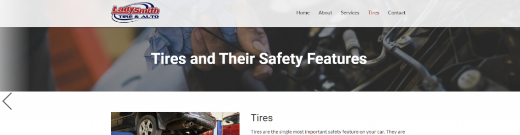
If you choose a layout other than overlay, make sure the text area still has a good heading, and it flows properly with the rest of the page. However, this may cause the header to be over 350px tall, but it should not take up the entire upper fold.
The interior hero section should be utilized on all interior pages, though occasionally there may be an exception. But for each interior hero, you must keep the height in the range of 200-350 px tall. Also ideally the interior hero image will have text laid over the image, usually the name of the page.
Avoid interior hero layouts like the following:

Or like this:

Hero styles need to remain consistent from page to page within all the interior pages. They should not vary in height or style.
If there is poor color contrast within the interior hero section, which is below 3:1 color contrast ratio, points will be deducted. Also if you use a bold background color with small text, or any other color choice that doesn’t fit the rest of the site’s color scheme, or work with the selected industry.
If the text is aligned in a distracting or unprofessional way, if the text is too far up against the edges of its container, or there is not sufficient white space for the image and text, points will be deducted.
The image needs to reflect the product, service, or information of the customer.
If your company deals in sky diving equipment, would it make sense for you to put up a hero image of a person scuba diving?
It only makes sense to relate your hero image to the rest of your website. The image must reflect your brand’s values and principles. If the image is deemed completely unrelated to the business or casts the business in a negative light points may be deducted. It is also important to make sure that the interior hero images are clear and in focus. If the image is blurry it may be hard for the user to tell what the image is trying to display and points may also be deducted.
Unless specifically requested by a customer, all interior pages need to have some kind of hero section. The hero section does not always need an image. It can be a gradient, solid color, animation or parallax.
An important part of the interior page hero section is the size of the text. If the text is too small, it doesn’t really serve a purpose.

Just like with the hero section on the home page, it's important to choose a layout based on the hero image. For example, the interior hero section image below doesn’t work well for a stripe because it goes through the focal point of the image.

Interior pages should have content readily available without scrolling. The page name, and the h1 should be above the fold no matter what device you are using. The hero section on interior pages is the ideal place to place the page heading. In most every case, there isn’t a reason to leave a large hero image or section without any text or CTA.
Ideally, the text over the hero image will be the name of the page that they have landed on.

Graphics
Graphics - 9 points
(3 points)
Image/Icons/Videos - Quality and Function
All images need to be full resolution, and if they have a function, it needs to work properly.
If any images are stretched or appear pixelated, this will lose points.
If you have a photo gallery, and when you mouse over the hand with the pointer finger appears, then you need to make sure the images click to enlarge. If they don’t enlarge, then it will confuse or annoy the user.
If the customer provided both low resolution images as well as high then we need to use the high resolution images first.
CRITICAL ERROR
If you use an image of a swimming pool and the industry is a law firm, this would be an issue. Bottom line is that it is vital for all images to be relevant to what the company does.
If a customer provides images and asks to use them on a page, we need to make sure they are used to break up content within the page. We should not opt for adding a grid of stock images to the last row.
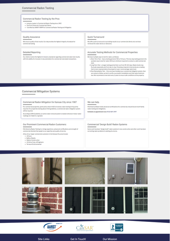
Description coming soon
If the video causes the site to crash anyway or it lags, etc. We need to troubleshoot the issue and ensure they are all working properly.
(3 points)
Image/Icons - Alignment
All images are icons are aligned properly.
Description coming soon
When using a photo gallery on a page it's important to make sure that the column is aligned with the rest of the content on the page and it formats properly across all devices.
When you have images within a row, in most cases they need to be the same height and similar widths. The example below shows what happens when two images have a different height and width.

If an icon is being used next to text it is important to make sure they are in line or directly side by side. Below is an example of icons aligning with text and icons not aligning with text.


(3 points)
Color
The colors will be deemed acceptable when minimal colors are used, when they properly contrast, and match the industry or specific requests of the customer. For most sites, you should keep the background white, and use other colors for accents.
Color Contrast
WCAG 2.0 level AA requires a contrast ratio of at least 4.5:1 for normal text and 3:1 for large text. WCAG 2.1 requires a contrast ratio of at least 3:1 for graphics and user interface components (such as form input borders). WCAG Level AAA requires a contrast ratio of at least 7:1 for normal text and 4.5:1 for large text.
Large text is defined as 14 point (typically 18.66px) and bold or larger, or 18 point (typically 24px) or larger.
Hint: Colorzilla is an excellent tool for extracting the color value from any page element. Additionally, WAVE can analyze contrast ratios for all page text elements at once.
Use our link contrast checker to evaluate links that are identified using color alone.
A good rule of thumbs the default background for all rows with paragraphs should be white. When you place bold colors behind text, it reduces the readability. Rows should have light backgrounds, with occasional off white, accent color, gradient, or background images used sparingly per page.
EX 1:
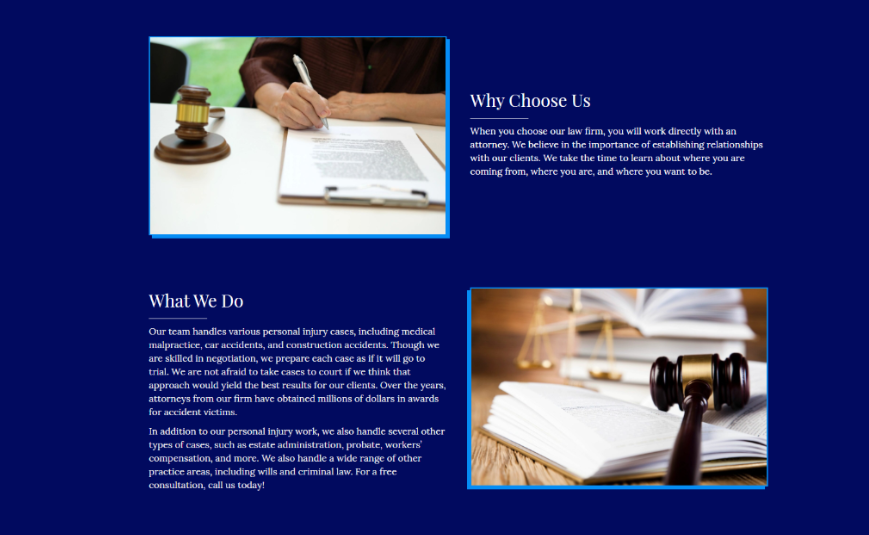
EX 2:

When choosing the appropriate colors, first look at the logo, branding materials, or product images provided by the customer. If there is no logo or any color palette unique to their business, you want to explore if there are colors associated with their business. See https://styleguide.pwsgallery.com/color/. If the colors chosen have nothing to do with the business or industry, like red on a landscaping site, points will be deducted.
If the customer asked for a specific color but it goes contrary to industry standards, you can still use it, but make sure it's utilized as an accent color, and does not dominate the site.
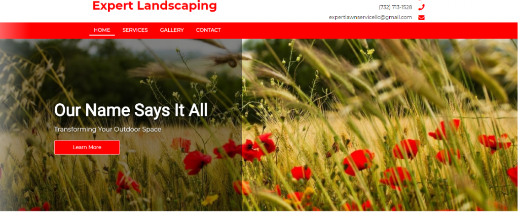
Generally, no more than 3 colors should be used on a website. The primary color, accent color, and white/black/gray counting as the third element. In rare circumstances there may be exceptions, but points will be deducted if there are too many different colors used on a site. Too many colors will make things look too busy and unprofessional.
Don’t use the same or similar colors for text and background. The more visible the text, the faster users are able to scan and read it.
The W3C recommends the following contrast ratios for body text and image text:
- Small text should have a contrast ratio of at least 4.5:1 against its background.
- Large text (at 14 pt bold/18 pt regular and up) should have a contrast ratio of at least 3:1 against its background.
EX 1:
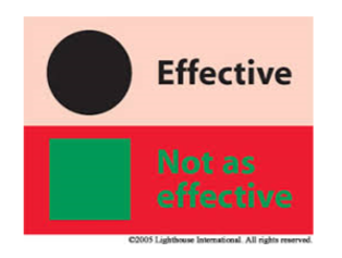
EX 2:
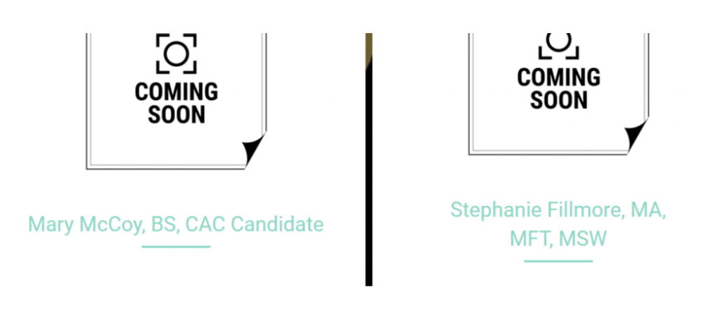
EX 3:
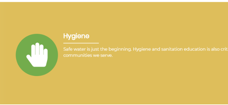
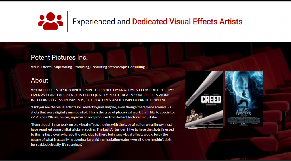
After we add some more opacity the text has a higher contrast and the row is less busy allowing you to read the text without distraction
CRITICAL ERROR
Content
Content - 19 points
This is where we check the basic business information to ensure the pertinent details and motives for the website have been established and adhered to.
(2 points)
Content - Layout
When you are jamming too much content without any adequate breathing space on your pages, it can leave your visitors feeling overwhelmed as they have to focus extra hard to absorb the information.
White space is simply the gaps or blank area between content like headline, subtitle, body, images or videos —simply put, it’s the empty spaces on a page.
How does white space help improve your website?
1) White space helps make your website look more sophisticated and elegant
Minimalist designs give people the impression of elegance, sophistication, and beauty.
When you add more white space in your webpages, you are making your pages more “minimalistic” and better put together.
EX 1:

EX 2:
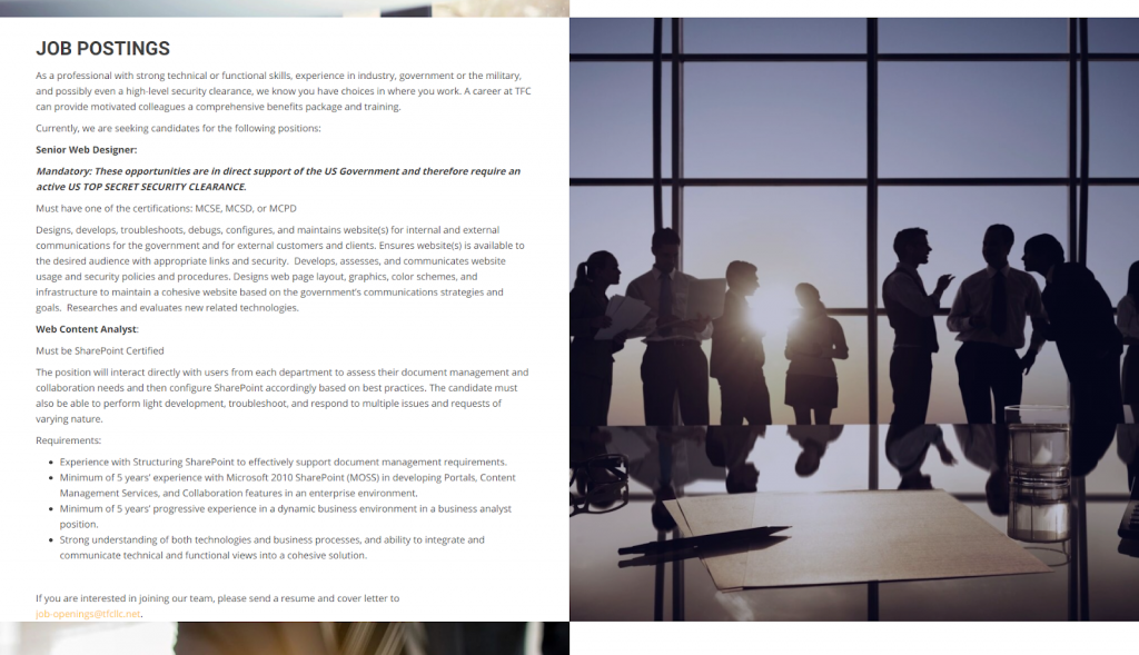
EX 3:
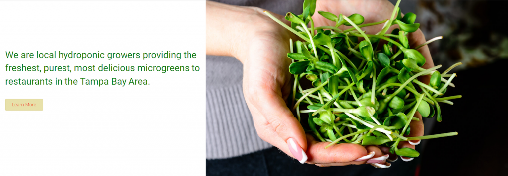
Row separators are a great way to break up content. Geometric shapes were a big website design trend in 2019 but in 2020, it’s all about organic shapes. Organic or fluid shapes are anything that doesn’t involve straight lines. Think of the shapes that happen in nature, like hills or the way the edges of a lake or river are asymmetrical and winding.
Fluid shapes are a great way to break up sections of a website without harsh lines or angles. They’re also great to use in the background, like the way Android uses circles behind products on their homepage.
However, when you use any row separator, it needs to blend into the next row. Meaning the color of the adjacent row has to blend into the row separator. You can see in the examples below, the background of the row separator is while while the background of the adjacent row is a non-white color. This is an incorrect use of a row separator, and points will be deducted if this happens.
EX 1:

EX 2:
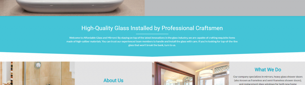
EX 3:
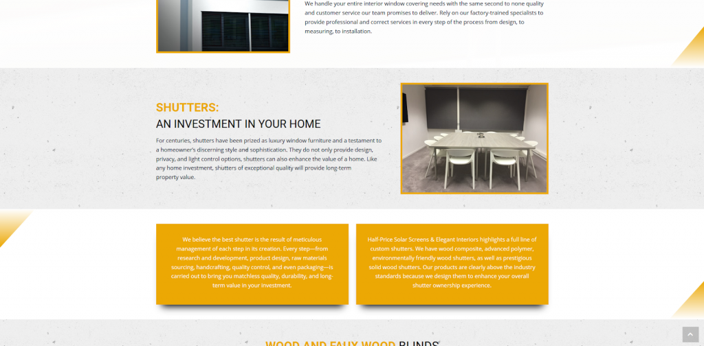
This error will be called out when we see content laid out in a way that is boring, not creative, out dated looking, bland, or just not thought out well. The following screenshot shows what would be considered content poorly arranged within rows.
EX 1:
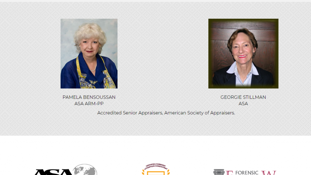
EX 2:
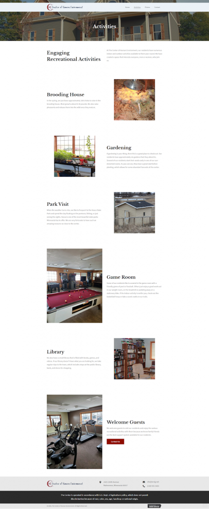
EX 3:

The range of acceptable margin or padding between elements is 7-10% of its container. For example, if you have a container that is 500px wide, then you need to have 35px - 50px of space between elements. The example below only has about 20px
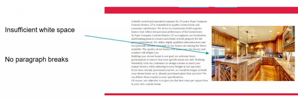
When you use a row background, you need to be careful about how much content you place over it. Generally large amounts of paragraph text, and multiple sections of information should not all be placed over a background image. This reduces readability, and can result in a messy row.
EX 1:
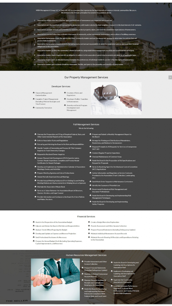
EX 2:
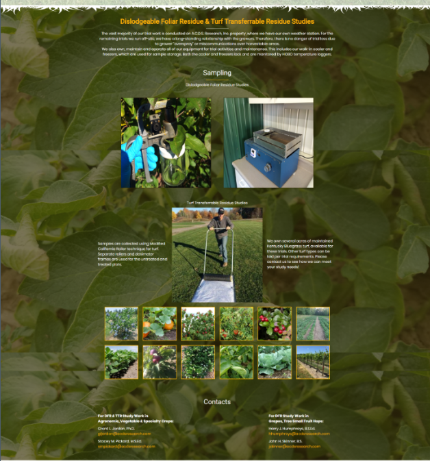
There are some instances where you might have a site built with consecutive rows that have background images. Generally these sites have very tall rows that take up the height of the screen, and each row can be anchored to from dots along the side, or a sticky header.
However, outside of this format, it's not a good idea to have multiple rows with different colors and background images. Sites need to maintain a consistent theme and color scheme. If every row is colored differently, it just ends up looking like a mess. See the screenshots below.
EX 1:
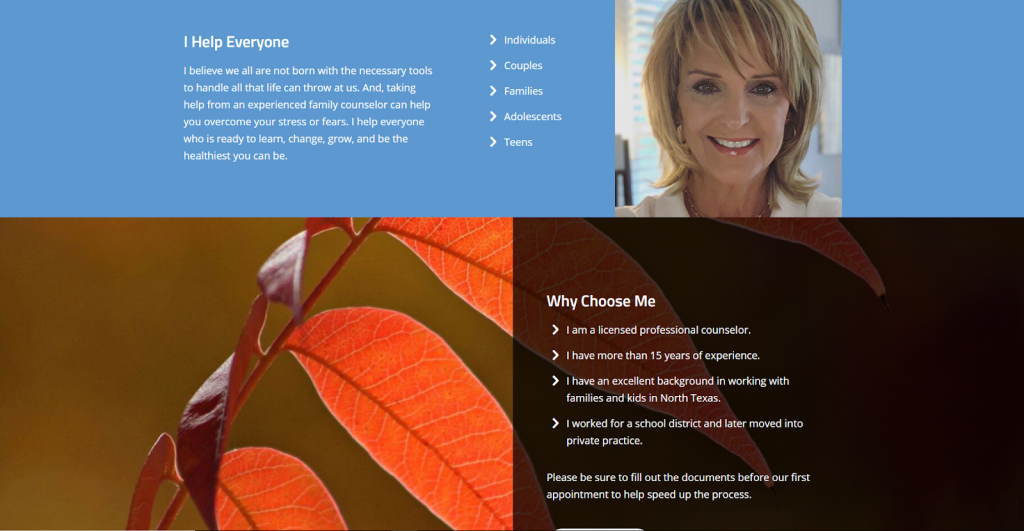
EX 2:

EX 3:
This error would be that anywhere in the content area (meaning not the header or footer) there is visible HTML or CSS showing on the front of site.
This is an error where two elements that are not supposed to be layered on top of each other are overlapping.
(2 points)
Content - Consistency
One of the top principles of good UX is to keep the interface consistent throughout the entire product.
Design consistency is the act of keeping all of the repeating elements of your website the same throughout the entire site. This encompasses everything from the placement of buttons and icons to the colors and fonts you use.
Heading styles, paragraph styles, colors, buttons, links, image styling, spacing, icons, patterns, layout, basically all site elements must be consistent from page to page
This would be where you have paragraph headings styled differently in different places. Generally, h1’s, h2’s, and h3’s will all have a set of defined styles, and they should be maintained in each instance they are utilized.
Sometimes we might have a grid layout for products, posts, teams, or anything that is laid out with multiple columns. It’s important that within the same row, all these fixed width columns are the same height. If they are not, it creates a sense of unbalance.
Similar to what was mentioned above, the widths of columns also need to be consistent, and not vary based on the content.
Description coming soon
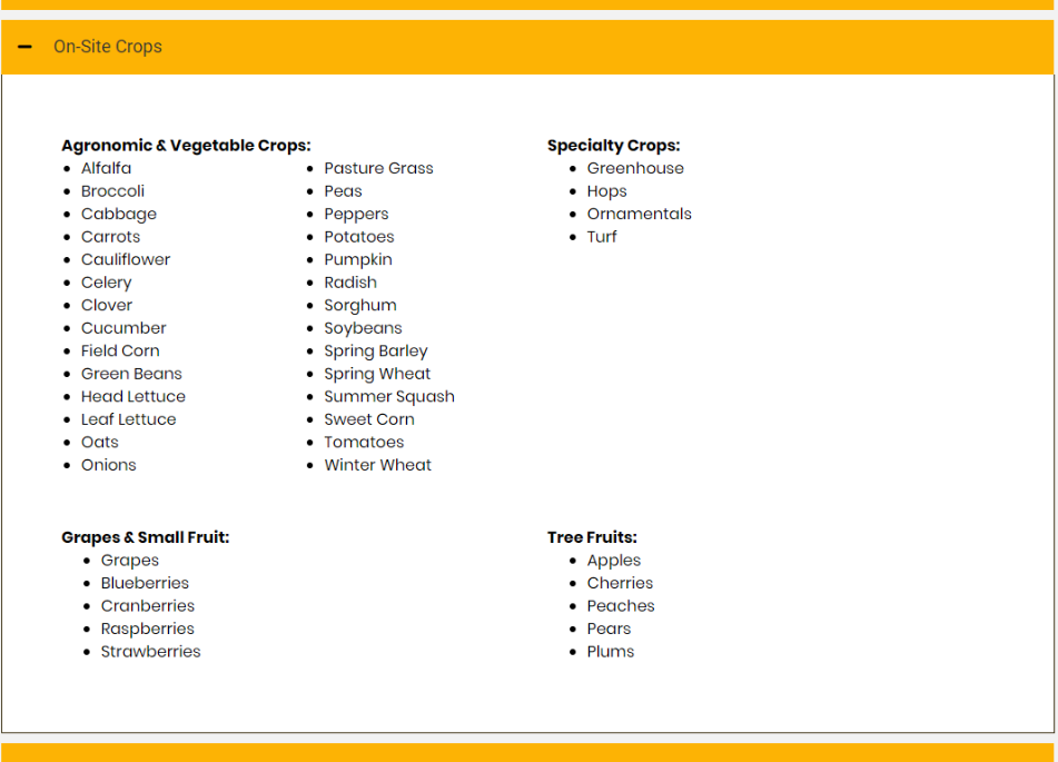
You can see in the screenshot below that within this container, the content alignment is not consistent. The “Grapes and Small Fruit” and “Tree Fruits” should be in the same column as “specialty crops”
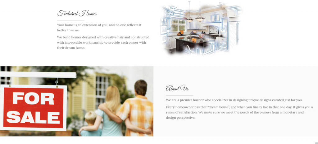
If you are creating a layout with text and images alternating, it's important for the widths of the paragraphs to remain consistent. This usually is a result of inconsistent row widths. Make sure there is a clear flow from row to row. The example below features paragraphs of different line lengths.
(3 points)
Necessary Content Missing or content added incorrectly
All the requested content is present on the site.
CRITICAL ERROR
Specific images, text, products, modules, plugins or anything in scope that was specifically asked for and will not have a clear, negative impact on the site or the site performance was not added.
(2 points)
Typography - Style
The typography follows all best practices

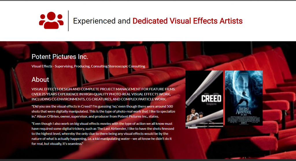
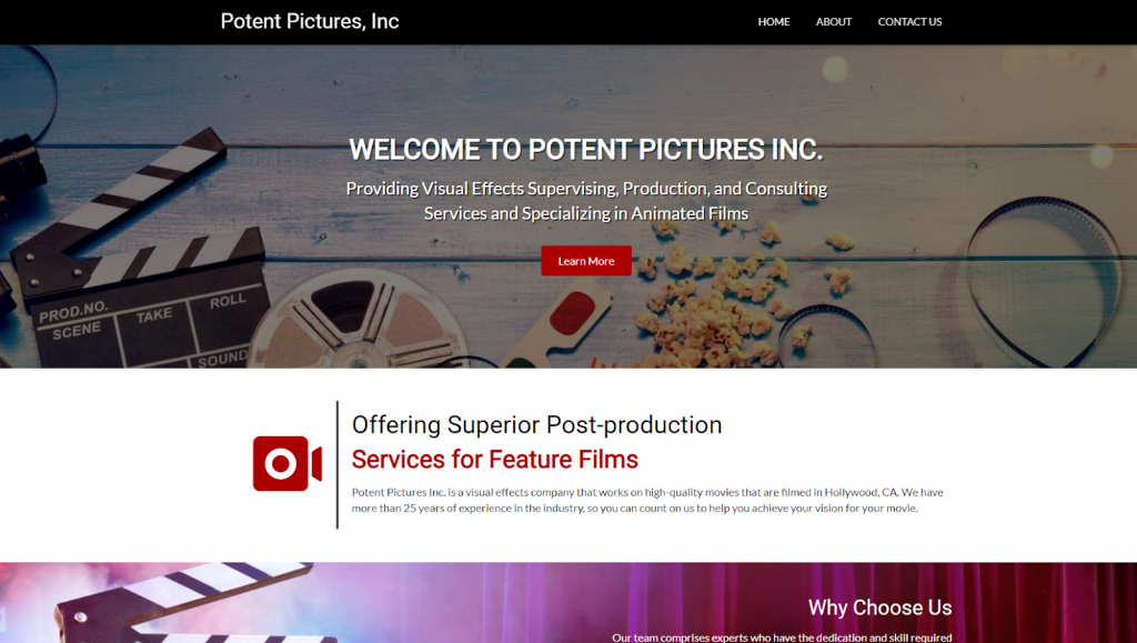
Another example is the following site. This company does visual effects for major Hollywood films. But when you look at the site, the heading and body text are very similar, there is no style to it, it’s boring, bland, and does reflect the personality of the company.
As the designer, you have discretion to override the font choice. We are encouraging the Website Specialists to suggest fonts or at least a wider variety, but please make sure to select an appropriate font for the customer. Poor font pairings, such as serif paired with serif, will result in loss of points.
Example of poor font pairing
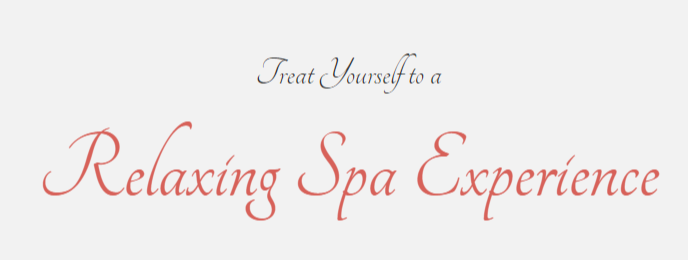
Examples of good font pairing
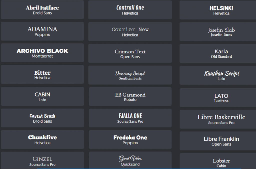
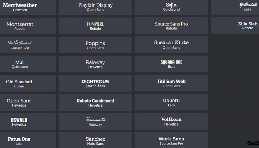
Fonts that share no relationship at all are not great together. Intent is another foundational aspect of design -things that look random and haphazard tend to evoke a feeling of discord.
If you use a font pairing that seems off upon inspection from the QA Analysts, and we find it’s not a pairing suggested in the above graphics, or a pairing recommended in Google fonts, you may lose points.
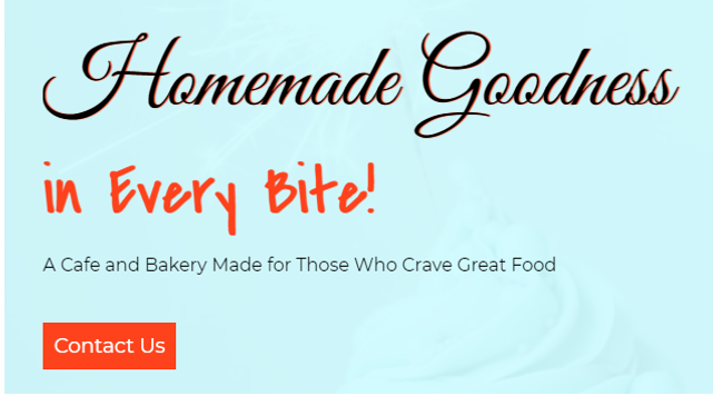
Make sure h1s, h2s, and all headings use a different font from the body text. If not, it's acceptable to have thin and ultra bold paired together if you have a font that has a variety of font weight options.
Sometimes the fonts might be different, but look very similar, cause a bland look.
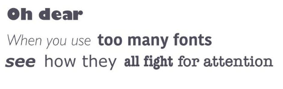
Experts usually try to keep a number of fonts within two or three for the same layout. It allows making an essential contrast between copy elements along with saving the balance and right message of a design. Applying different styles (bold, italic) should also be minimal. They are good for emphasizing really important parts but the overuse of them can make the text look messy.
(2 points)
Typography - Paragraph Length
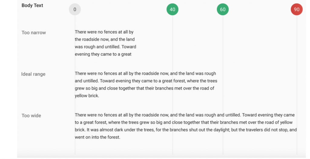
Having the right amount of characters on each line is key to the readability of your text.
It shouldn’t be your design that dictates the width of your text. Consider this advice on readability and line length from the BaymardInstitute:
Limit Line Length
“You should have around 60 characters per line if you want a good reading experience. Having the right amount of characters on each line is key to the readability of your text
EX 1:
EX 2:

No single line of text including headline and paragraphs are to exceed 100 characters (including spaces and punctuation).
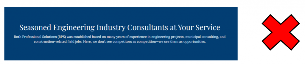
- For centered paragraphs - Centered paragraphs should not exceed 90 characters in a single line (including spaces and punctuation), be more that 5 lines, or more that 1 paragraph
(2 points)
Typography - Paragraph Alignment
The paragraph is left aligned, and doesn’t violate any of the conditions as laid out below.
All paragraph text must be left aligned
Text may be centered only if:
- It is a single paragraph
- It has 5 or less lines
- It has a line length less than 90 characters per line (including spaces)
Some people think that centering all their text is more “artsy” or “edgy”, but doing so actually makes the brain work harder to process what it’s reading.
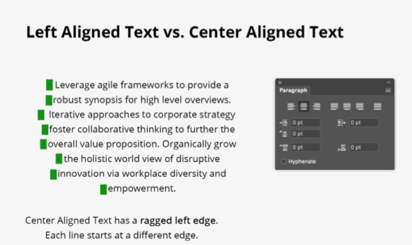
Avoid the following:
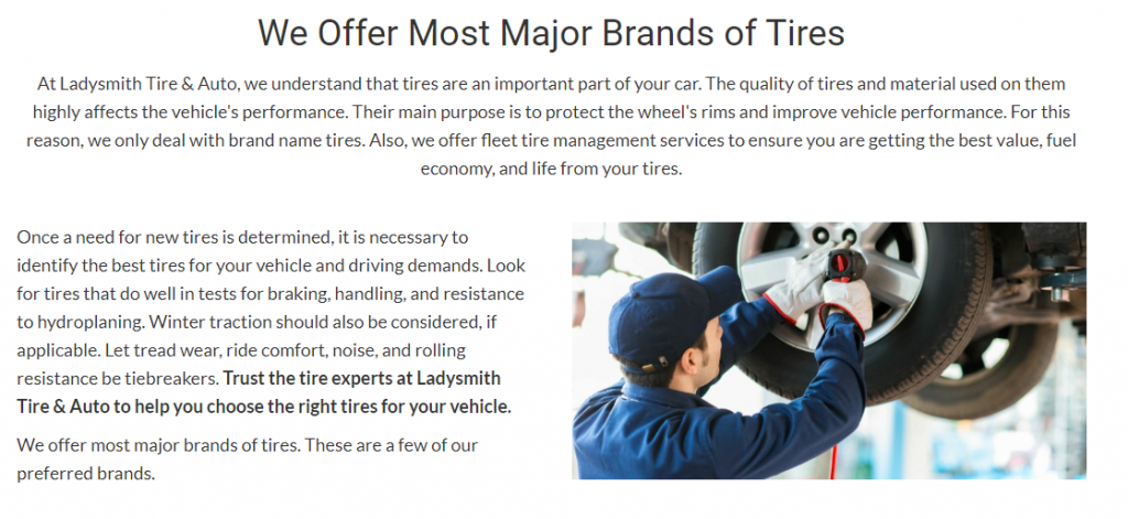
When Should I Center Text?
- Short Callouts
- To emphasize a point, date, deadline, etc., go ahead and center it.
- As with headers, it sets the information apart and draws the reader’s eye.
- If everything shows centered, nothing stands apart and it all blends in.
Centering a topic header or headline will set it apart from the rest of the content.
Other options for headers include different font sizes and weights.
Text should very rarely be right aligned. If it is, it should be to create a look of symmetry for decorative text. Normal paragraphs should never be right aligned or justified. (see the following)
EX 1:

EX 2:

If you are using a layout with two columns, you need to keep where the text starts in a consistent manner row over row. That is not to say you can’t have different layouts in different rows on the same page, but you need to make sure that the left margin overall is consistent.
Standard line-height is 150% of the font size you are using (1.5 em). This is important because the line height default for Beaver Builder is 1.45. You will need to adjust this on EVERY BUILD in the custom settings area. Recommended line height is 1.6 to start.
In web typography, the term for the spacing between two lines is line height.
By increasing the line height, you increase the vertical white space between lines of text, generally improving readability in exchange for screen real estate.
As a rule, line height should be about 150%, which means the space is 30% more than the character height for good readability.
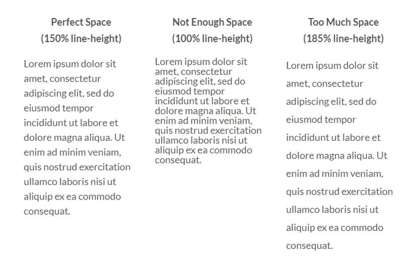
EX 1:
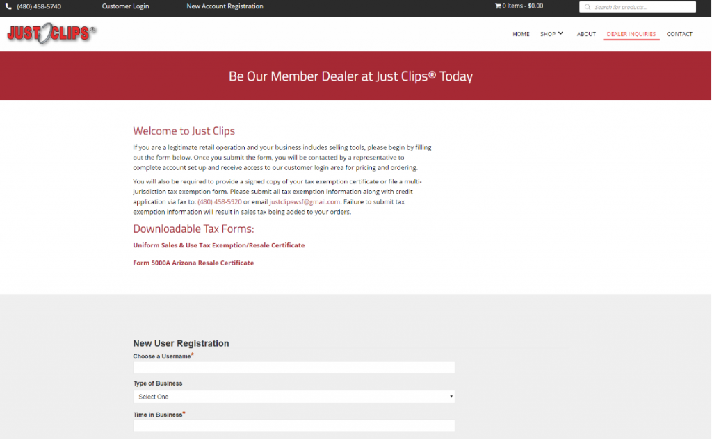
EX 2:
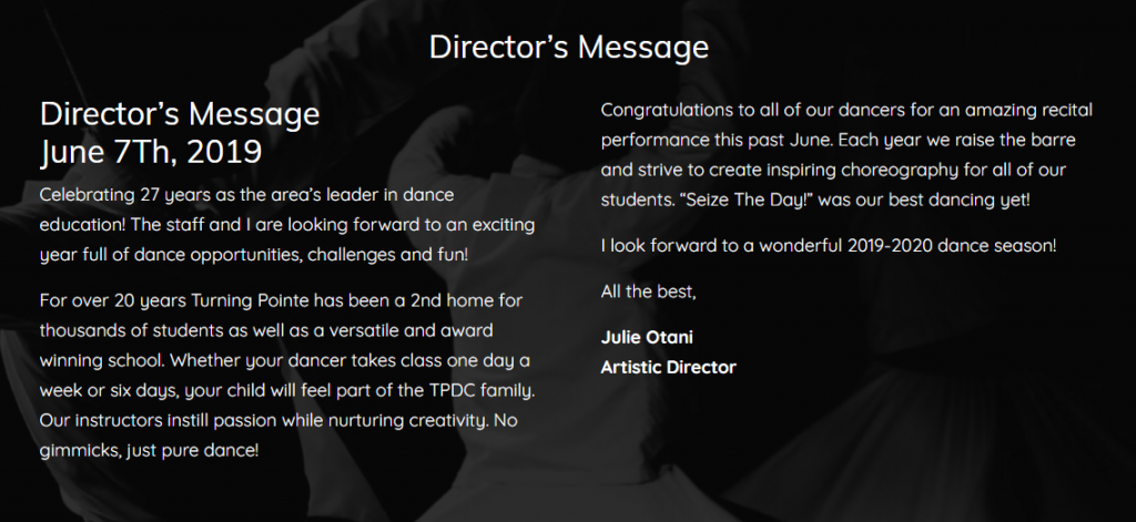
(2 points)
Typography - Paragraph Font
Font size acceptable.
If folks are reading for long periods of time, be nice: don’t make them strain their eyes. Now, each font is different, even at the same size, but we’re talking:
16px–absolute minimum for text-heavy pages
17-18px –a better font size to start with. You’re not printing out a single-spaced Word document; you’re writing for people sitting a couple feet from their decade-old monitors.
19-20px+ –may feel awkwardly large at first, but is always worth trying out in your design app. The best-looking text-heavy site on the web, Medium.com, has a default article text size of 21px.
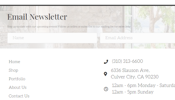
The following is an example of text that is too small:
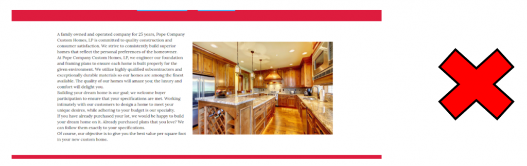
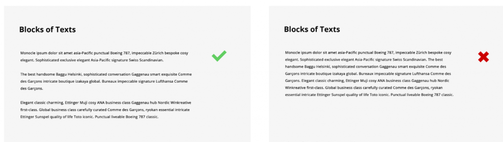
Do you layout blocks of text like icebergs?
Break up overwhelming large blocks of text to make it easier for users to digest the information.
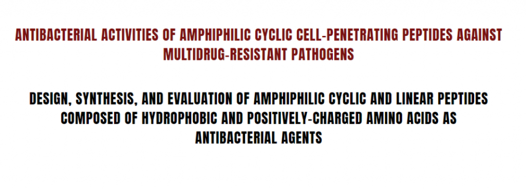
Capitalizing all characters on a text or message makes it appear like you are screaming and imposing on your readers.
It is unpleasant to the eyes and most of the readers won’t even get to the end of the message as it will likely put them off.
(2 points)
Typography - Headings
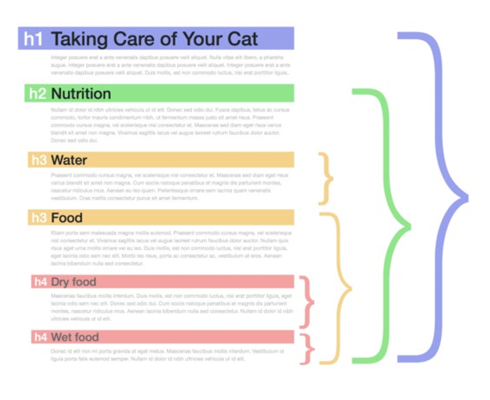
Headings help guide you through the content. They give context to paragraphs. They stand out from the copy blocks and allow you to quickly scan them to get a good sense of what those paragraphs are about.
THE IMPACT OF HEADINGS
- Readability Headings help guide you through the content. They give context to paragraphs.
- Accessibility While most users may only care what a web page looks like in a browser, some users with disabilities rely on well-formatted HTML to read and navigate the web.
- SEO Putting keywords into your headings can help boost your SEO.
HEADINGS SHOULD GROUP RELATED CONTENT
Headings are all about the content. That’s the whole reason they exist. A heading should describe all the content beneath it until you reach another heading of the same or higher level.
That means you might have to restructure some paragraphs or even other headings to make sure your content is grouped appropriately.
It's vital that isolated paragraphs or groups of paragraphs include some kind of heading.
If you are pulling content from an old site, and you recognize that paragraph headings are missing where we require them, we ask that you add them. When adding the headings, come up with your own, and use this as your method for deciding what to put:
- Is there a clear, concise few words that would sum up the paragraph? If so, use that as the heading
- If #1 is not applicable, just repeat the first sentence of the paragraph as the heading
- If that won’t make sense, or the sentence is just too long, use another sentence or group of words within the paragraph and copy and paste those as the heading
- If that won’t work or doesn’t make sense, just use the company name or page name as the heading of the paragraph. Don’t use lorem ipsum or a generic “heading 1”
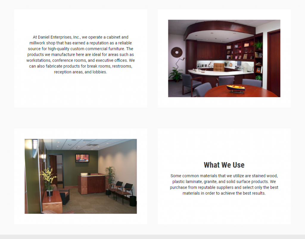
In the example below you can see there is a heading that is positioned to the right side of the row, but is center aligned, with an icon to the left. This is an example of a heading not positioned properly. This heading should be left aligned with the icon, or the icon should be removed and have the heading centered in the center of the row.
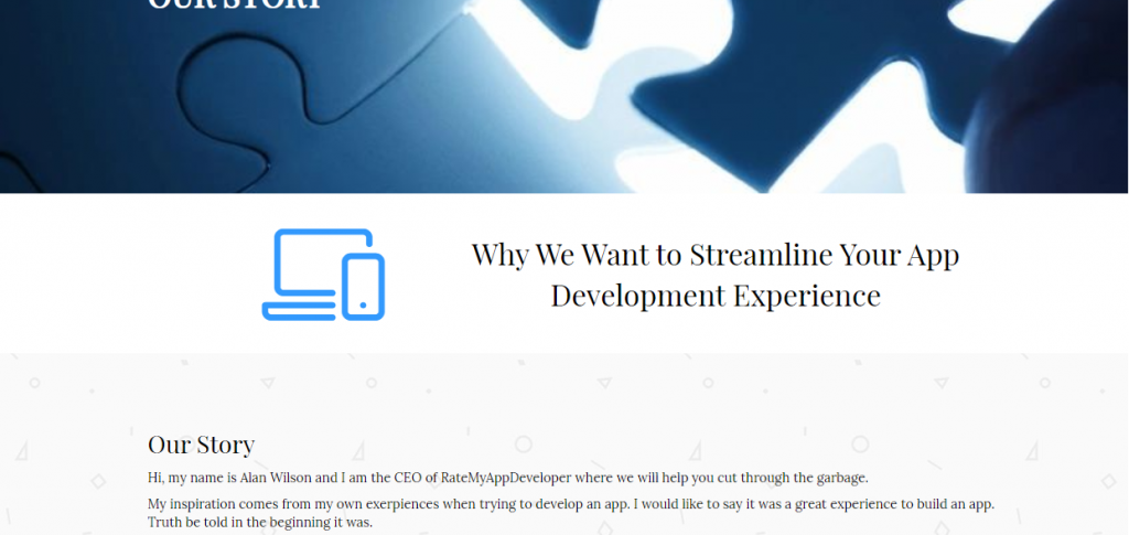
Also if there is an instance on a page where the layout remains consistent row to row, but the headings keep aligning differently, points would also be deducted.
The below example is a poorly styled heading. It is using a drop shadow over a background resulting in a dated, unattractive look.

Headings need to stand out from the rest of the text. They need fonts that spread to the personality of the company, and are relevant to the industry. Large, bold, brief type with sufficient padding above and below will always be the best way to go.
If you have a hero heading, you never want to repeat that same heading or a very similar heading right below it.
EX 1:

EX 2:
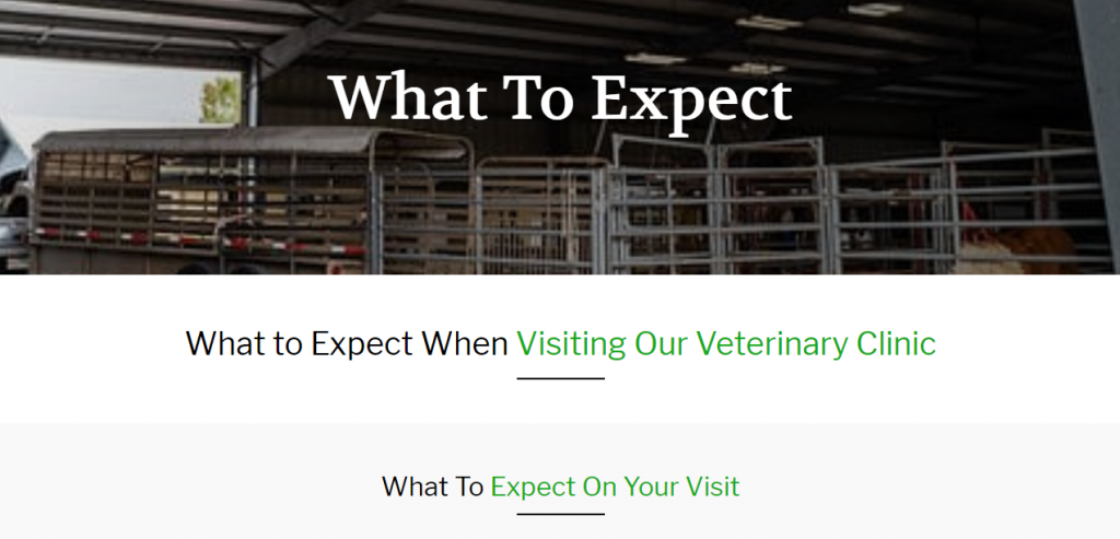
EX 3:
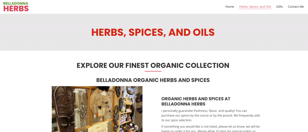
CRITICAL ERROR
If you have a hero heading, you never want to repeat that same heading or a very similar heading right below it.
CRITICAL ERROR
This call out is reserved to text that does not make sense in America, or contains racial slurs, vulgarity, or any kind of profanity or inappropriate language.
(2 points)
Typography - Quality of Copy
Acceptable copy is free of spelling and grammar errors, reads smoothly, uses proper American terminology and phrases, and has the proper punctuation.
Any spelling errors should be caught by the Builder or the initial QA. Any remaining spelling errors with result in points deducted.
CRITICAL ERROR: If the name of the company, phone number, address, or the names of any employees on the site are spelled incorrectly, this will result in an immediate fail. However, if this is found, it would marked as a critical error under “Contact info on website conflicts with intake form” in the “Business Contact Info” on the form
All text should be spelled correctly, but other spelling errors within the content of the site will not be considered critical.
This is defined as any copy that while being grammatically correct, just doesn’t make sense for the site. It might also be where
We don’t have a tool that checks for grammar errors. However, if we notice any within the paragraph text or text within the internal pages, it will be marked as a loss of points.
CRITICAL ERROR
If a site is returned that contains profanity, racial slurs, sexually explicit verbiage, or anything not requested by the customer that is offensive language, it will be an auto fail.
If there are random non English characters, punctuation or symbols in places they should not be, this will be called out as an error
Functionality
Functionality - 12 points
(2 points)
Buttons and Links - Style
All buttons are stylized appropriately to match the rest of the site colors being used.
If specific colors are requested in the intake form we need to make sure that we are using those colors for things like buttons and accents. We should not be using random colors.
We need to make sure that all button styles are consistent throughout the site. We should not be using multiple shapes/hover effects. Below is an example of poorly styled buttons on a site.
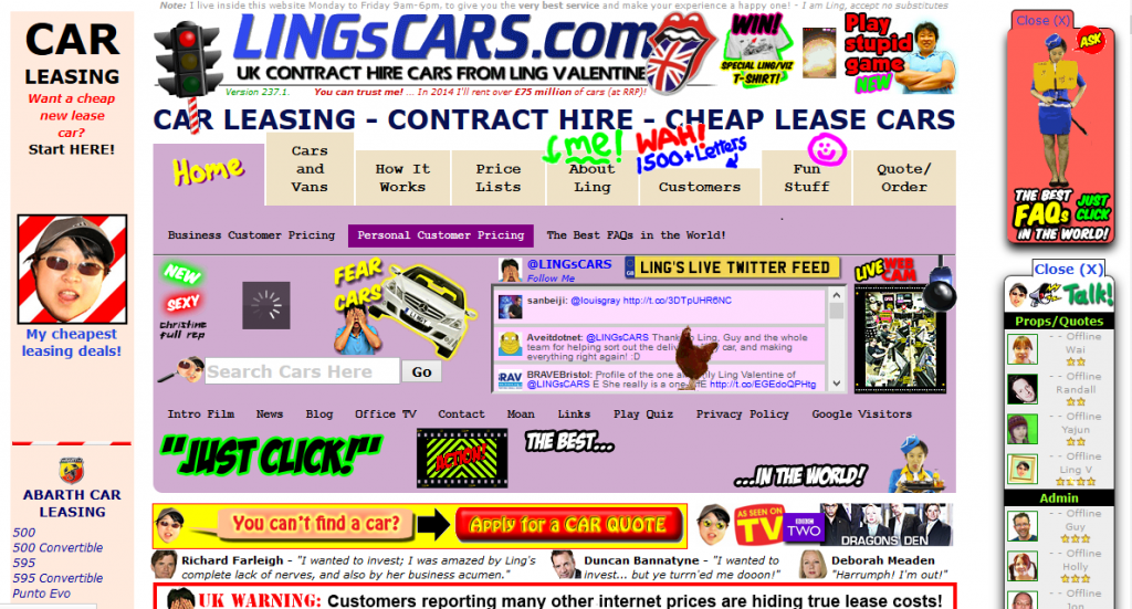
The link or button color or style does not match site design.

This is where there is a long URL written out, than often spans the length of one or two lines, instead of using a button or CTA text
EX 1:
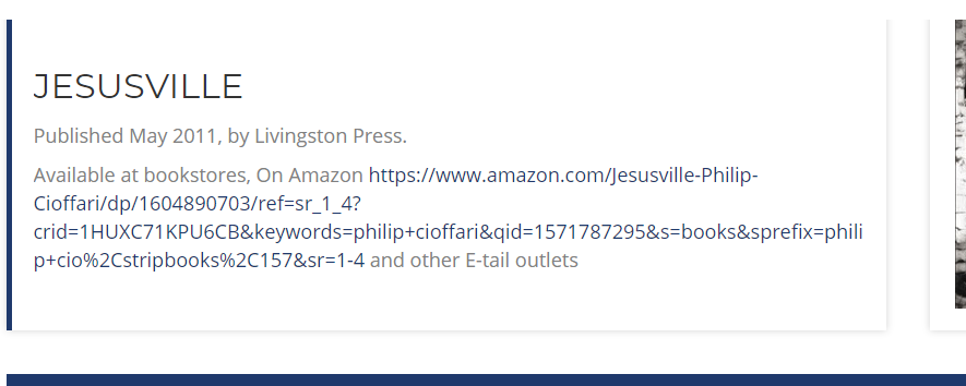
EX 2:

The below examples provide a visual idea of what it looks like to place too much text inside a single button. Buttons need to contain just enough info for users to understand where they will be directed when the button is clicked.
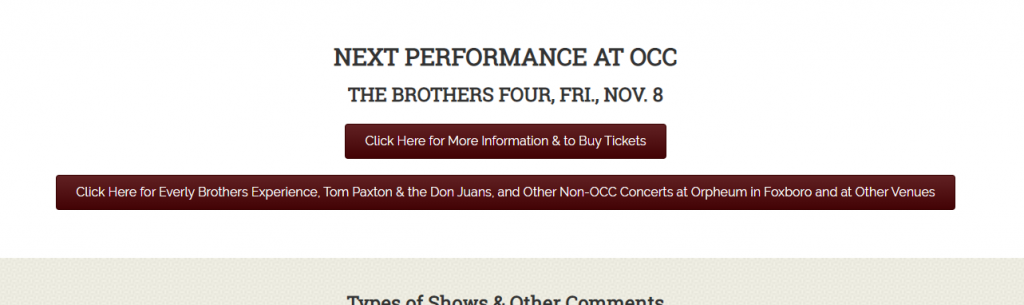
If the button background color contrasts poorly against the container in which the button is placed inside, or if the button has poor contrast against its text, it will result in points lost.
Button backgrounds and text need to pass the color contrast test.

(2 points)
Buttons and Links - Functionality
Description coming soon
Description coming soon
Description coming soon
Description coming soon
Description coming soon
Description coming soon
Description coming soon
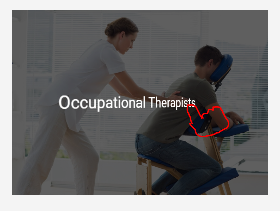

(3 points)
Modules and Plugins
All plugins that were requested are set up and functioning properly.
CRITICAL ERROR
If the customer requests a plugin, such as gravity forms, Bookly, Give, IMPress Listings, Events Calendar, etc. it must be installed, and set up to the best of our ability. That means if the customer has events, for example, we add the events, and create themer layouts when needed to properly style the layout. Points will be deducted if the plugin has either not been installed, or has been, but was set up incorrectly, styled poorly, or anything else that would be determined to be an error.
An example would be:
Placeholder events being set a few weeks to month ahead of due date so customer can see functionality
If the customer has a membership site, or any kind of site that requires access to the login/register pages built into WordPress, there needs to be a clear way for customers to access it. If no log in/register/sign in/ button can be found, points will be deducted. Also if the links don’t function properly, or a request that is in scope relating to login/register pages is not correctly implemented, it will also count against you.
Description coming soon
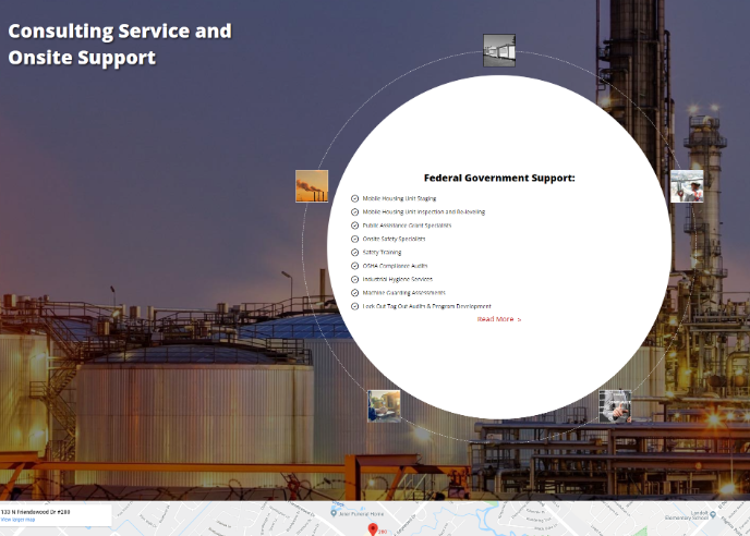
In the example below, we show an example of unnecessary use of an accordian. There was an accordion used and a gallery placed at the bottom when the content could have been easily put into three separate rows utilizing the images within the rows instead of all together at the bottom of the page. Each accordion had a minimal amount of text, and there was not much going on in the page.
EX 1:
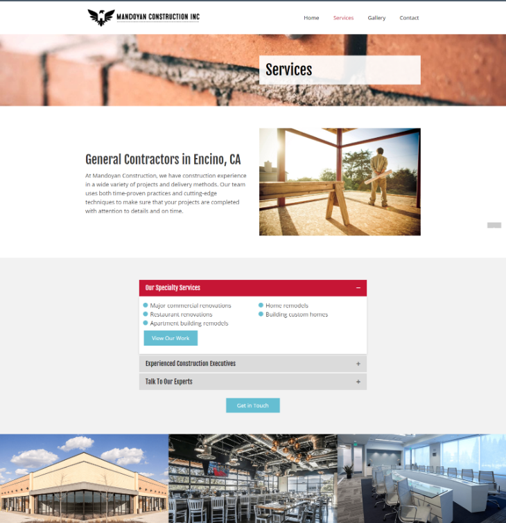
EX 2:

EX 3:
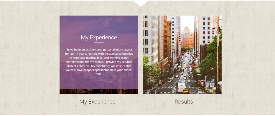
EX 4:
EX 5:
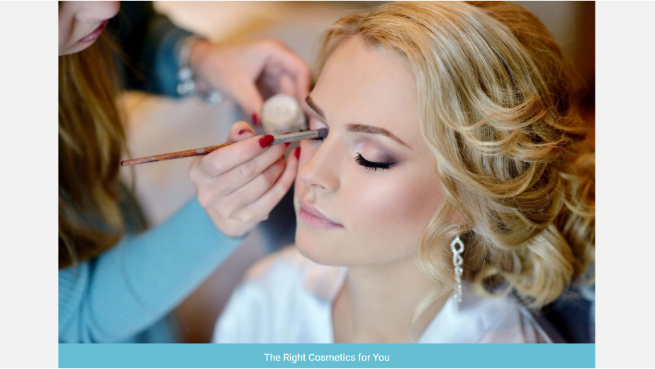
EX 6:
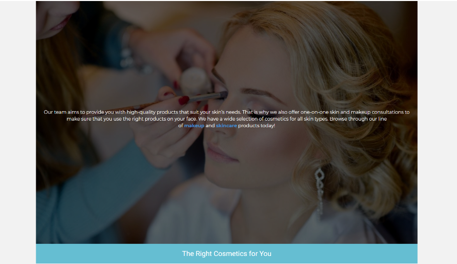
If the customer asked for a specific module to be used we need to make sure that we are using that specific module.
CRITICAL ERROR
(3 points)
Contact Forms
Contact form is styled nicely and follows rules regarding appropriate fields to be used & no misspellings as well as function properly.
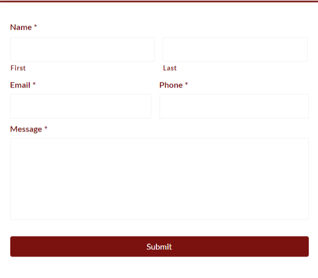
Form fields do not line up whether in height or width & do not seem to flow with the site design.
If the Website Specialist calls for specific fields to be used on a contact form it is important that we use those fields unless they go against guidelines (confidential information). If the fields are not added and there is no clear note regarding why points may be deducted.
CRITICAL ERROR
Confidential information includes but is not limited to:
- Credit card number
- Credit card expiration date
- Credit card CVV number
- Social Security Number
- Drivers license number
- Passwords
- Passport ID
Even if the Website Specialist asks for these fields to be added, do not do so.
Description coming soon
(2 points)
SEO
An appropriate title tag was added & it tells the viewer what they will find on the site. All spelling & grammar is correct as well.
A title tag should describe what a page does, not what it is. Words like “Home” just tell you what a page is. This doesn’t help Google or our customers. Title tags including these sorts of phrases have a lower click-through rate.
Title tags are a major factor in helping search engines understand what our customers websites are all about, and they are the first impression many people have of their page through their google search results.
Title tags are used in three key places: (1) search engine results pages (SERPs), (2) web browsers, and (3) social networks.
As we are working to bring our overall standards of design to new heights in 2020, part of that is creating and adding a good title tag to every HOME page. We can settle for the Yoast generated title tag for the internal pages.
Because title tags are such a vital part of both search engine optimization and the search user experience, writing them effectively is a terrific low-effort, high-impact SEO task.
See articles like this for assistance generating title tags
https://mrs.digital/blog/title-tags-still-important-for-seo-2019/
But going forward the title tag should for the home page must not include the word “home” but must instead provide relevant information about what the website wants the users know.
Again, we are just doing this for the home page. The Yoast generated title tags for the interior pages are not ideal, but are sufficient for now.
All pages must include one H1 tag.
Each page must have one h1 tag present. If more than one h1 tag is on the page, or no h1 tag is present, points will be deducted.
All sites require a favicon. If the customer doesn’t have a logo, one still needs to be created using either a letter, a stock icon, or anything that can represent the business.
Responsiveness
Responsiveness - 20 points
This grades the overall style and layout of the header, nav, and hero on the following sizes:
Mobile - 375px
Tablet - 768px
Laptop - 1366px
(3 points)
Mobile Header, Nav and Hero
All elements in the header are legible, aligned properly and appropriately sized.
The text is not legible against the header/hero background.
Logo or navigation or other content on header, nav and hero are being overlapped. Below is an example of content being overlapped.

Text is not the proper size or not formatted consistently with other content in the header.
Hero text should not be too large to the point that it makes you scroll down super far to get to the rest of the content and it should not be too small to the point that you cannot read anything.
Text should all be visible and in line.
If a customer requests that we have the phone number and email in the header then we should just use icons.
Navigation
Description coming soon
CRITICAL ERROR
This will be chosen if the header, nav, or hero area of the mobile version contains an error that would be considered critical, and must be fixed before it’s customer ready.
(3 points)
Mobile Page Content
All page content is properly spaced and aligned.
Either images, text or icons are being overlapped by other content on the site. It is important to make sure that everything is legible and properly spaced.
Content needs to fill out the page appropriately. Below is an example of columns being too narrow on mobile view.
EX 1:

EX 2:

Description coming soon
Description coming soon
Form fields need to be all aligned and the same height.
Description coming soon
Paragraph or heading text should be no smaller than 16px and no larger than 21px.
(1 points)
Mobile Footer
All footer elements on mobile are properly aligned and spaced.
Social media icons, contact info and site links should all be lined up like the below example.
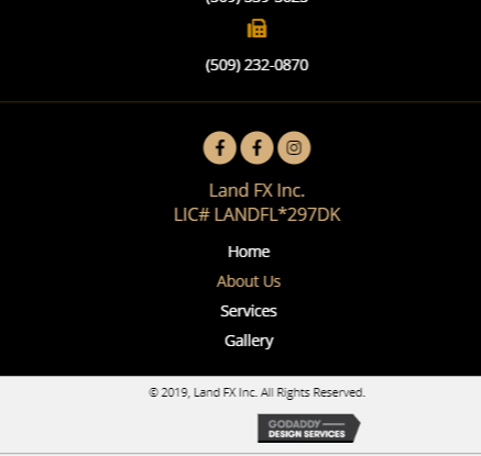
Content needs to be equally spaced out. Footer elements should not be directly on top of one another.
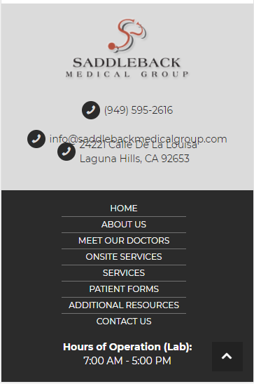
Elements in the footer should all be properly spaced. No large gaps in between contact info, site links, etc.
(3 points)
Tablet Header, Nav and Hero
Content in the header, nav and hero are all aligned consistently, not cluttered and the right font size.
Content in the header, nav and hero are being overlapped by other content on the site. Below is an example of content being overlapped in the header.

Either the header, Nav or Hero becomes aligned inconsistently by dropping to multiple lines.
Hero text is too large to the point that it drops on multiple lines/starts formatting awkwardly and creates a long scroll or hero text being too small that you cannot read it.
Realistically it is best to keep the header simple. If a customer asks for phone numbers, emails or social media icons to be displayed it is best to use icons only and make sure everything is properly aligned.
Navigation should be properly aligned with other items in the header. Either centered or in the far right corner of the site. Below is an example of the navigation being styled poorly. (Navigation is not centered)

Description coming soon
Paragraph or heading text should be no smaller than 16px and no larger than 21px.
(3 points)
Tablet Page Content
All page content is formatted and aligned properly.
Text, Images, Icons, etc are being overlapped by other content.

Content should not be squished or extremely stretched out. Below is an example of column widths being too narrow and appropriately sized.
EX 1:
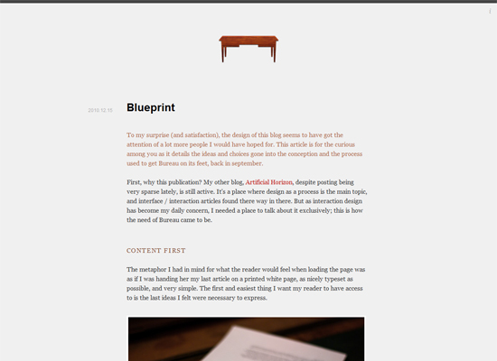
EX 2:
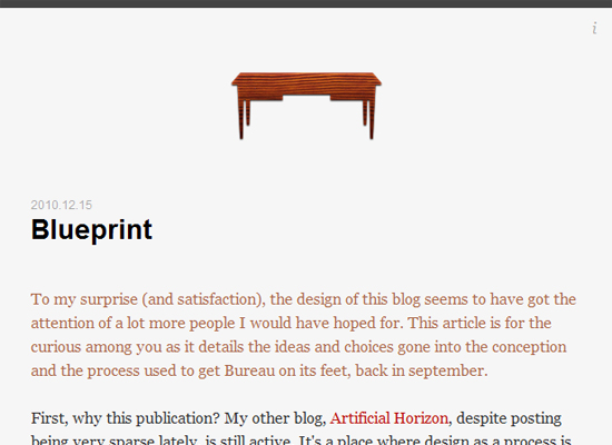
Text is not properly aligned with the content around it. EX: If there is a list of bullet points on a site rather than having them stacked they should be formatted side by side.
Form fields should all be the same height and length.
(1 points)
Tablet Footer
All elements are properly aligned, have the same height and are not overlapping.
Elements in the footer need to all be aligned. All contact info, etc. should be in line all the same height.
Elements in the footer should all be formatted properly. Contact info, site links, etc should be side by side.
(3 points)
Laptop Header, Nav and Hero
The header should resemble the desktop version and have no clear discrepancies that impact the design.
Sometimes when the screen resizes, the content converges into itself, and some elements go behind other elements. Make sure the widths are set correctly and right modules are being used.

If text, icons, or any elements in the header become misaligned or jumbled up in any way when it becomes 1366px then points would be deducted.
Sometimes when we have large hero text, especially when left or right aligned and placed in two columns, the text may start stacking or wrapping in a way we don’t want it to on 1366px break point. Instead of impacting the design on desktop, it would be ideal to create a new breakpoint and reduce the font size for smaller screens.
If there are too many links in the navigation, the navigation bar may start wrapping on 1366px. The fix for this is to either reduce the number of buttons, make the text smaller, use a hamburger icon, or reduce the space between the buttons.
(3 points)
Laptop Page Content
An acceptable laptop (1366px) view will look similar to the desktop. Since there is not a built in breakpoint within Beaver Builder, it may be necessary to add additional CSS to account for this breakpoint.
If content overlaps and does not stack appropriately, points would be deducted.
Sometimes when we add columns with 2 or 3 rows, the content may start stacking in a way we don’t want it to on 1366px break point. Sometimes low resolution images might go to 100% width, or columns with text might get squeezed to where words start wrapping one letter at a time. It’s important to check the tablet and account for any columns that may not be sizing properly.
Sometimes as the screen gets smaller, if a container has a fixed height, and the overflow is not set properly, then the text will start to overflow out of its container. Make sure that elements still stack correctly in 1366px, and make adjustments as necessary.
Content needs to be aligned in the same manner in which it appears on the desktop. Ensure that content within grids, images, content boxes, or any other element on the page does not get knocked out of alignment once the screen goes to 1366px.
The text starts breaking onto multiple lines where it should not. Ex: In the middle of sentences, etc text should not be dropping down to multiple lines as it affects readability.
Customer WOW Factor
Customer WOW Factor
How would you rate the site?
This is a more subjective grade that expresses the overall impression of the website from the perspective of the customer. It is not scored, but used as a way to categorize the quality of the site.
This is a site that encompasses everything we are looking for in a web design. The imagery, fonts, colors, layout all work together to prompt an immediate “Wow!” reaction.
This is a site that doesn’t give us an initial “wow” impression, but it seems well put together, consistent, and professional. It has quality imagery, and the correct fonts. There might be a couple minor adjustments, but for the most part its customer ready.
This is a site that just makes us say…”meh”. It's not that bad, but it will require some work before it’s presentable to the customer.
This is a site that has a lot of potential, but was just executed poorly. The colors clash, the fonts are small or dull. It gives you the impression of disappointment. Will need significant edits and polishing before being customer ready.
This is a site that completely misses the mark. This site looks amateurish, and in no way represents our company. Will need to be completely scrapped and redesigned from scratch.